
The growth of technology has lead to more and more transactions being conducted online. With this in consideration factors such as cost, convenience and security have grown in importance. There are many financial apps in the market but there aren't many that incorporate a multitude of features into a single application while also being designed well.
Users need a way to pay for goods and services in a simple and secure manner while keeping track of their financial information because they want to seamlessly purchase products and easily manage their finances from a central location.
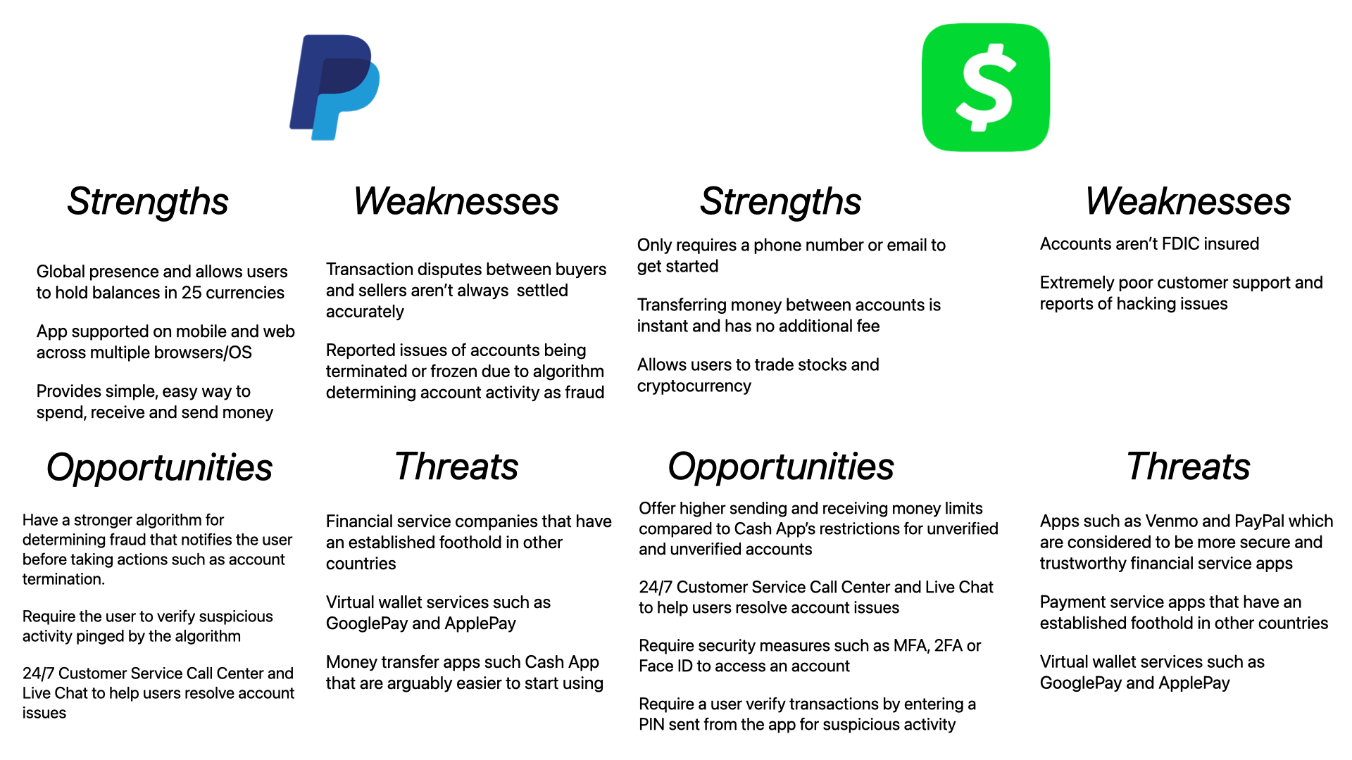
In order to understand how some of the major players in payment applications and money transfer applications bring value, I conducted competitive analyses of PayPal and Cash App.
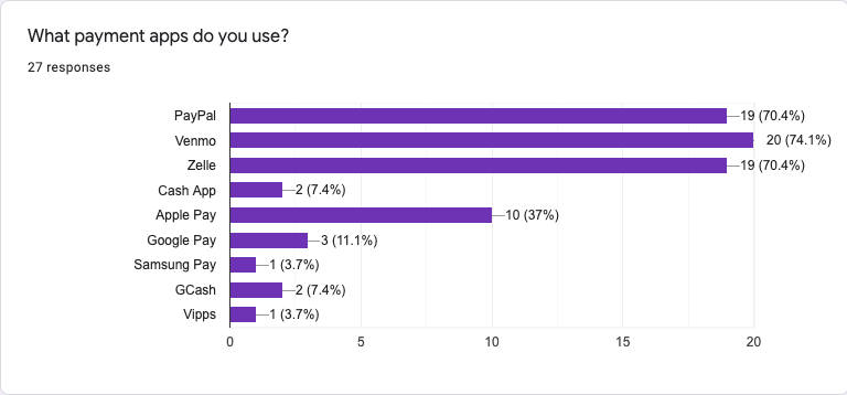
27 responses recorded

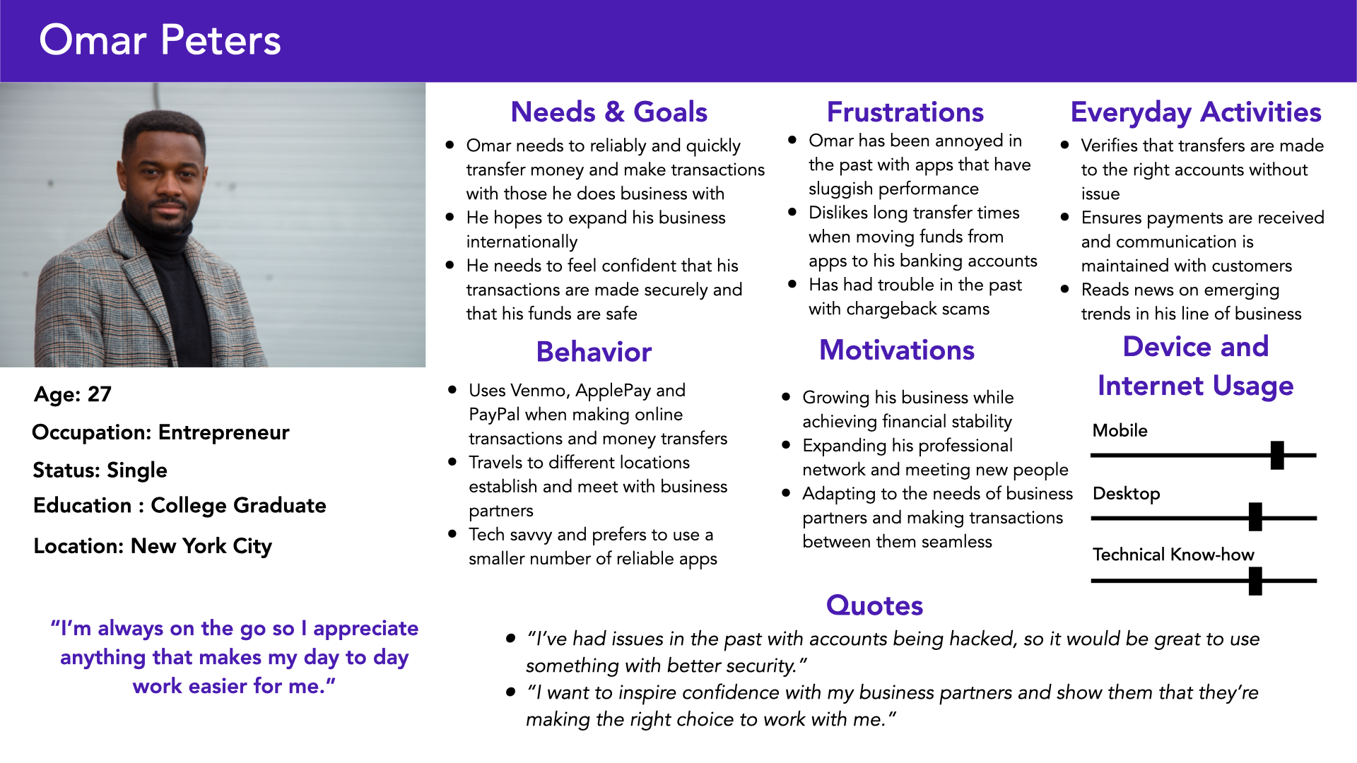
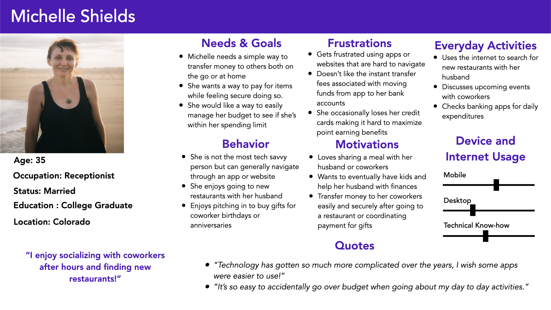
After conducting User Interviews and Surveys and reviewing the results to gain insights from my research, I then developed two personas that I thought would best represent some of the core users of my app.
With each persona created, I decided to further flesh out the process a persona could walk through to better understand them.
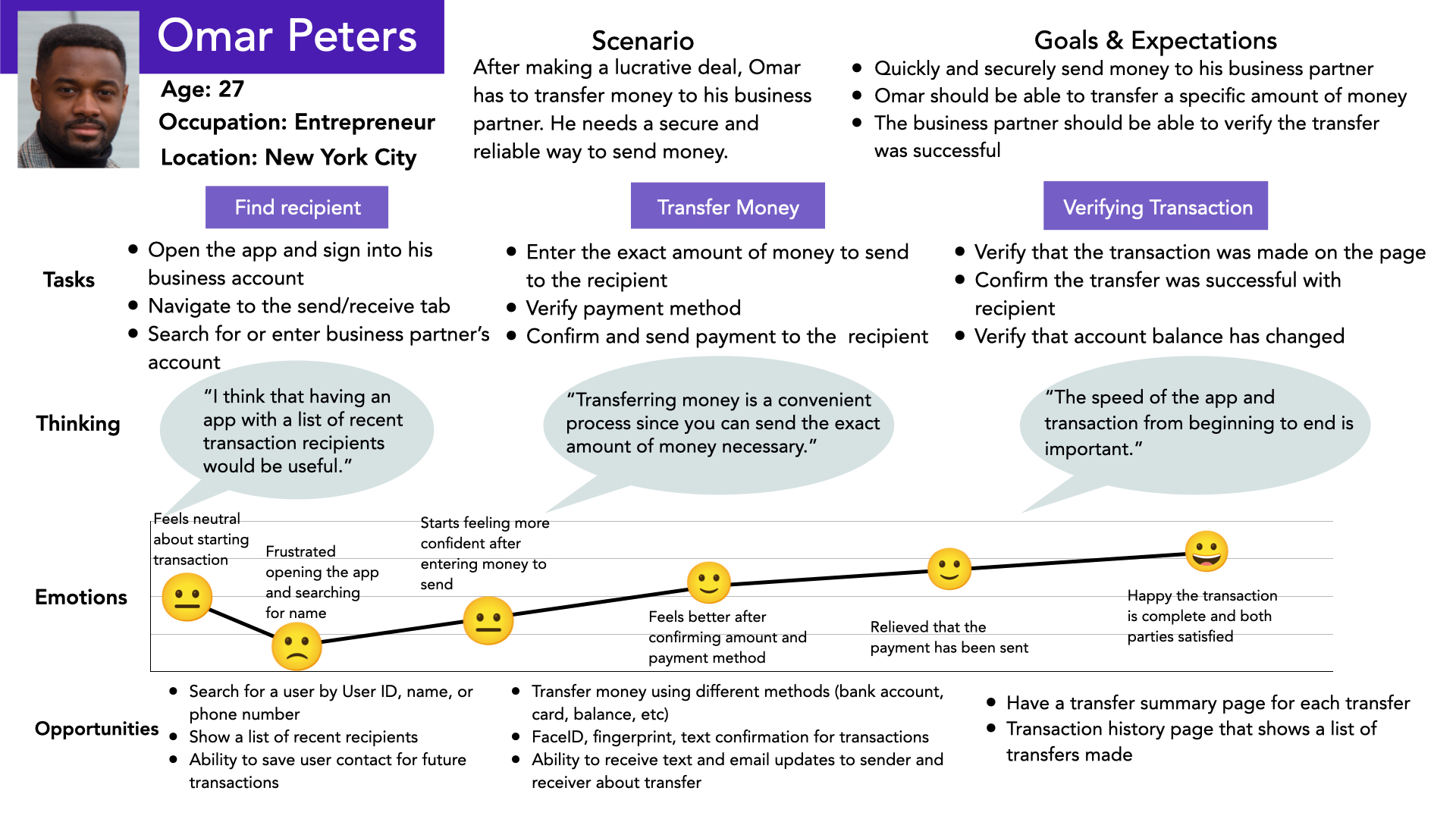
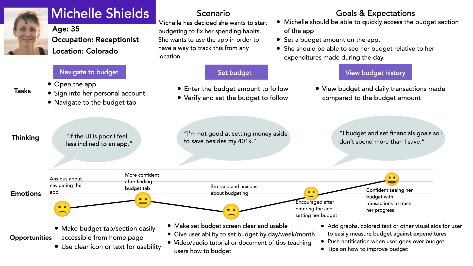
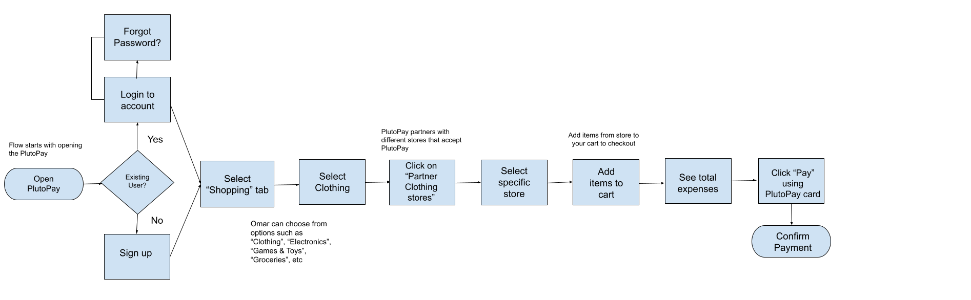
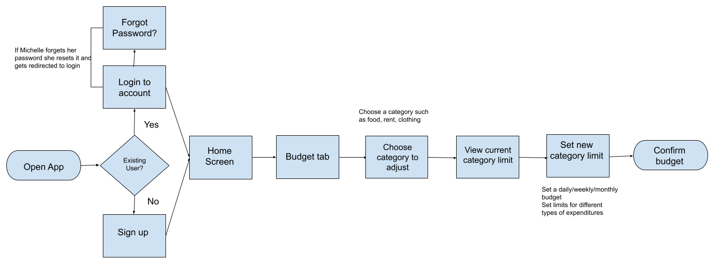
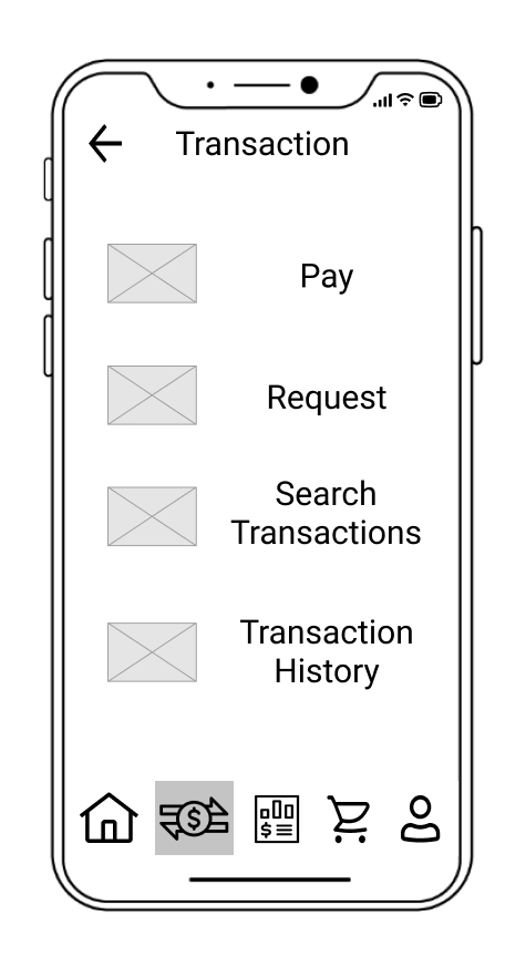
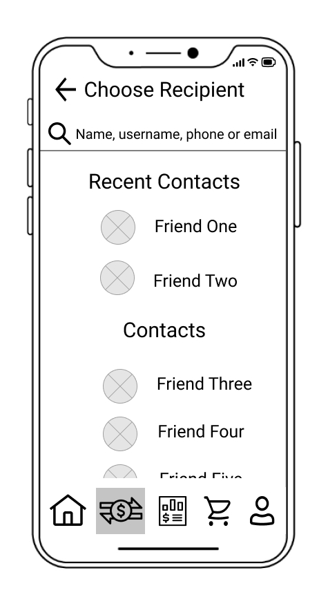
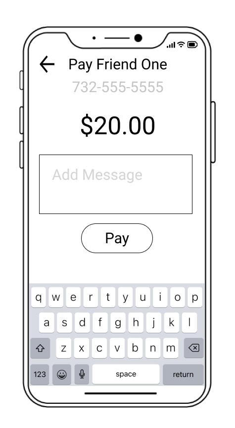
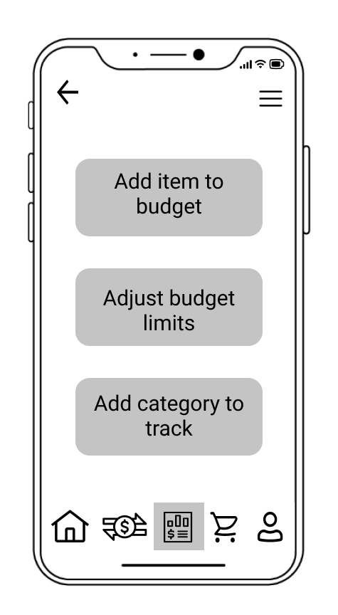
With the Personas and User Journeys as a foundation, I then created three flows that users would utilize when interacting with the app:
Once I designed my first sitemap iteration I conducted an open card sort to get a better understanding of how to improve upon the structure and layout of the app. I had 10 participants sort 20 cards and used their input to design an improved sitemap.
Results
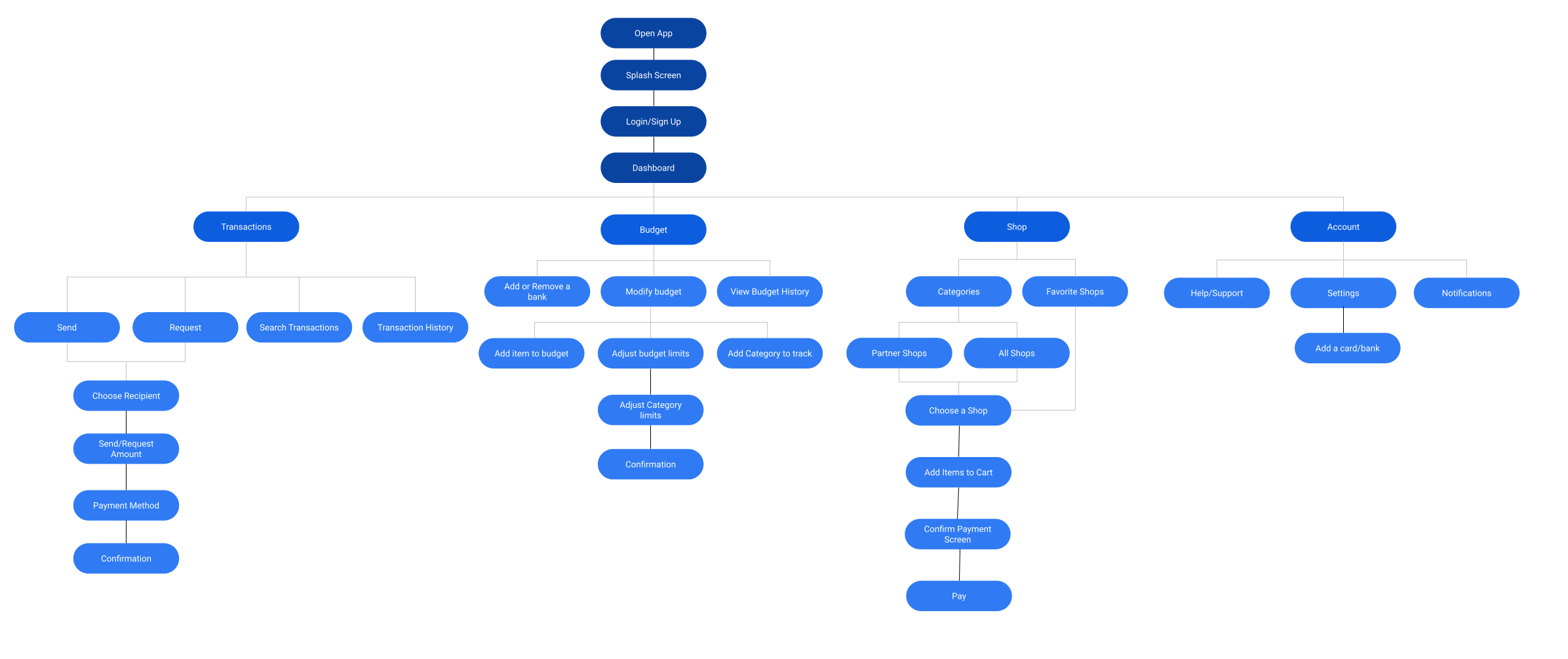
The card sort and analysis of the results gave me some great ideas on how participants grouped certain cards together which I used to restructure the sitemap as well as validate some of my initial ideas. I decided upon the sitemap below for the final layout of the app.
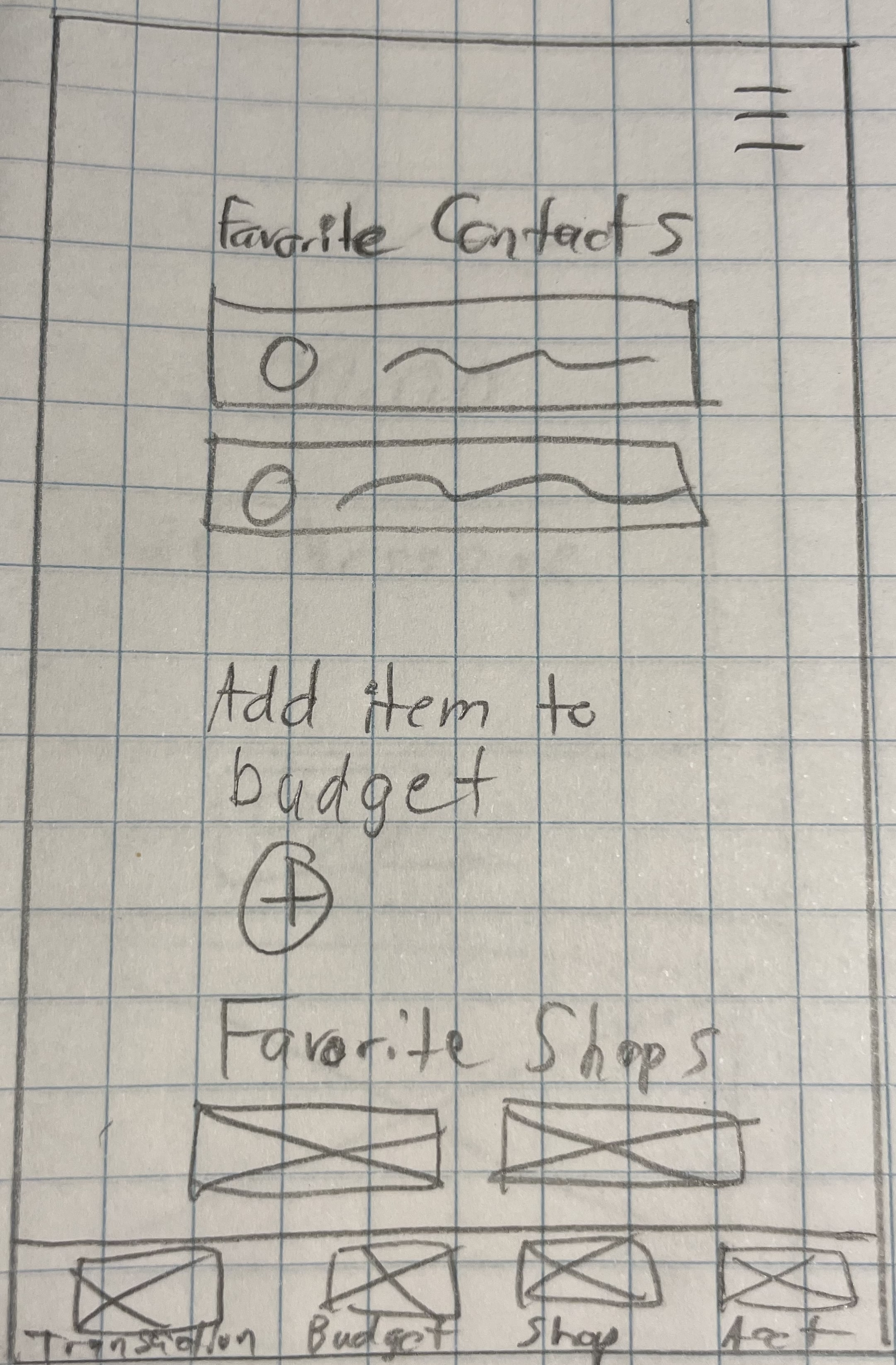
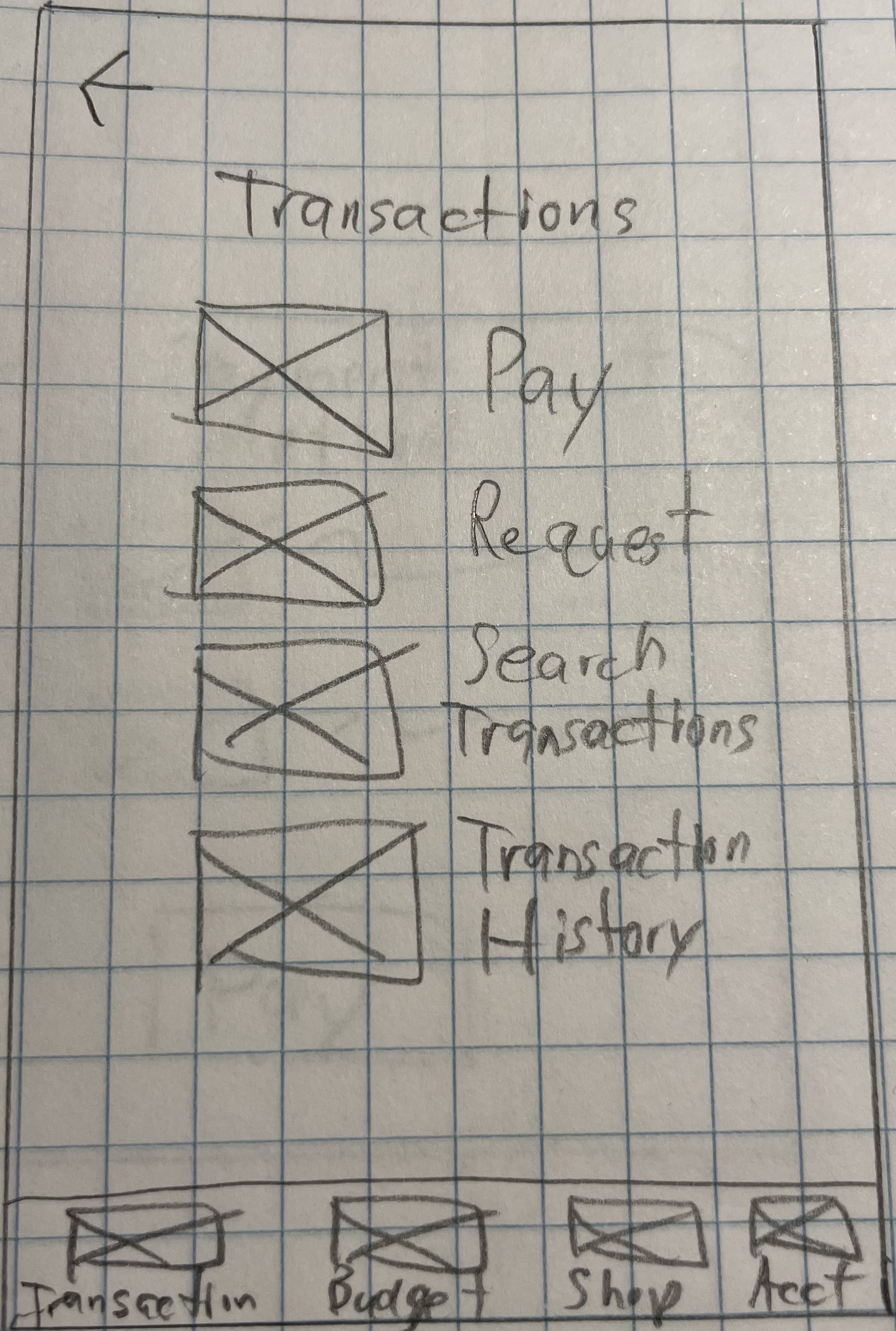
With my sitemap as a guide, I began designing my low fidelity wireframes based on the three user flows. In order to get my initial ideas out I used simple pencil and paper to start figuring out the content and layout of my initial screens. I focused on creating simple and intuitive screens that would allow the user to navigate the app without distractions.
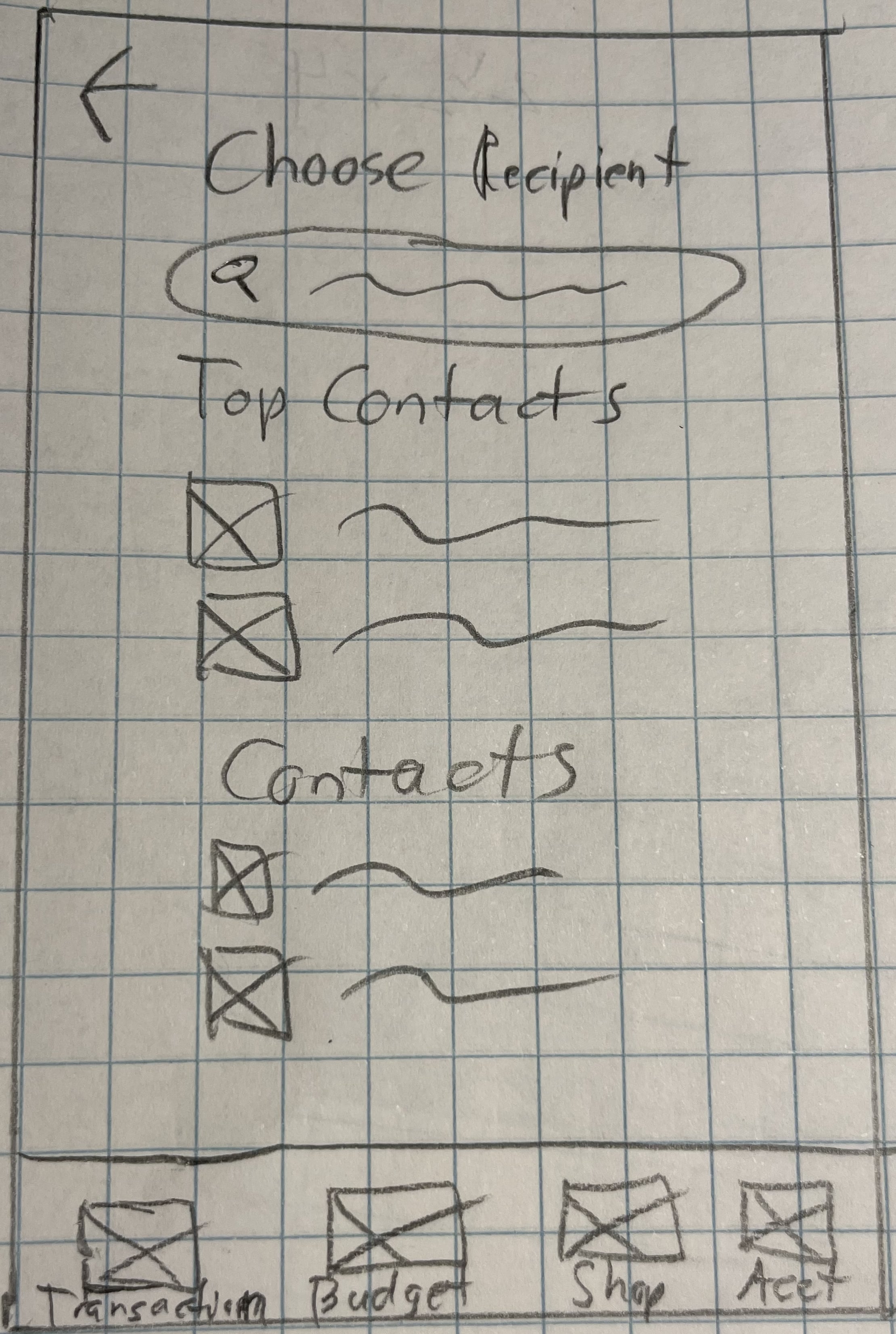
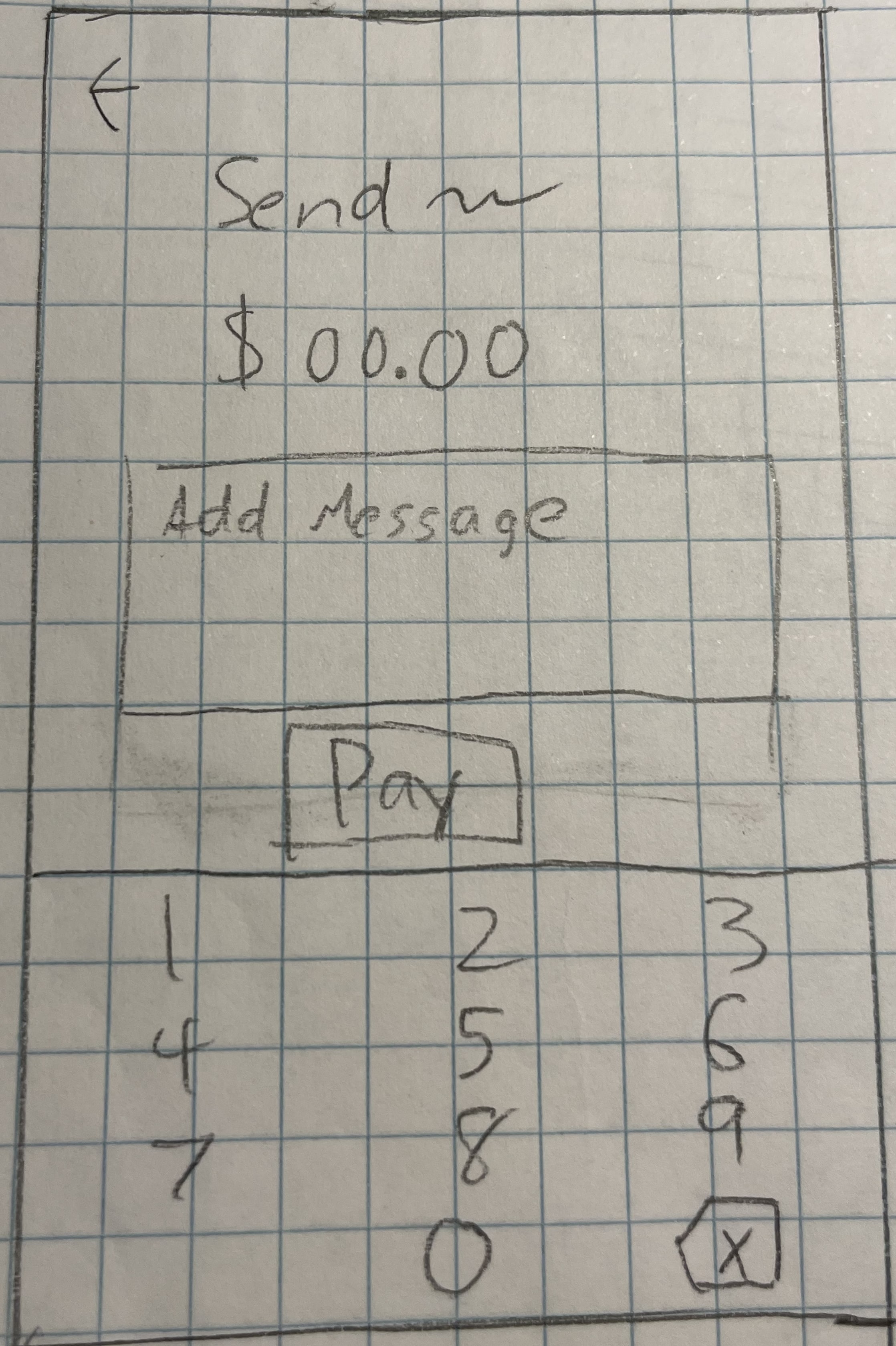
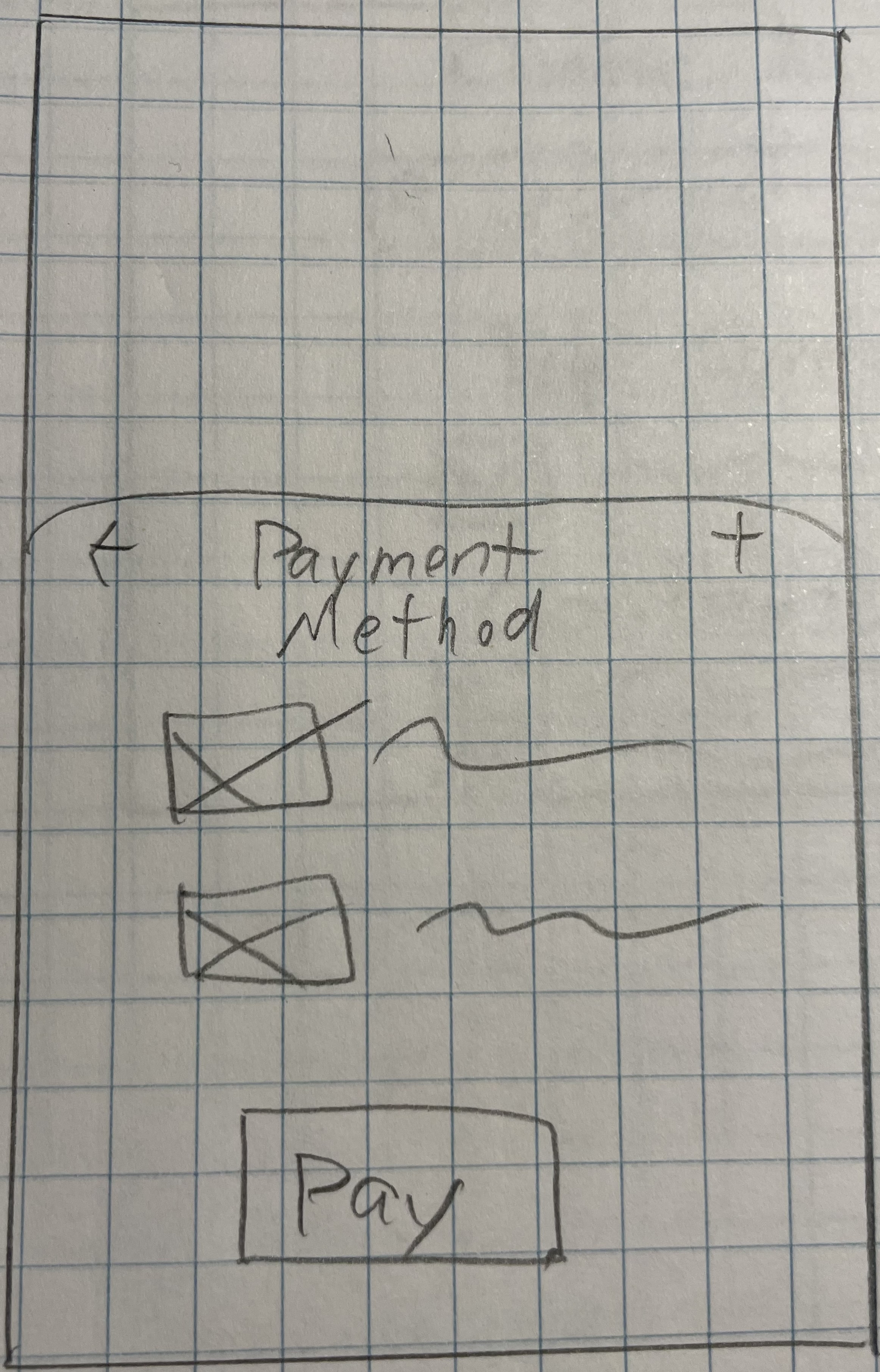
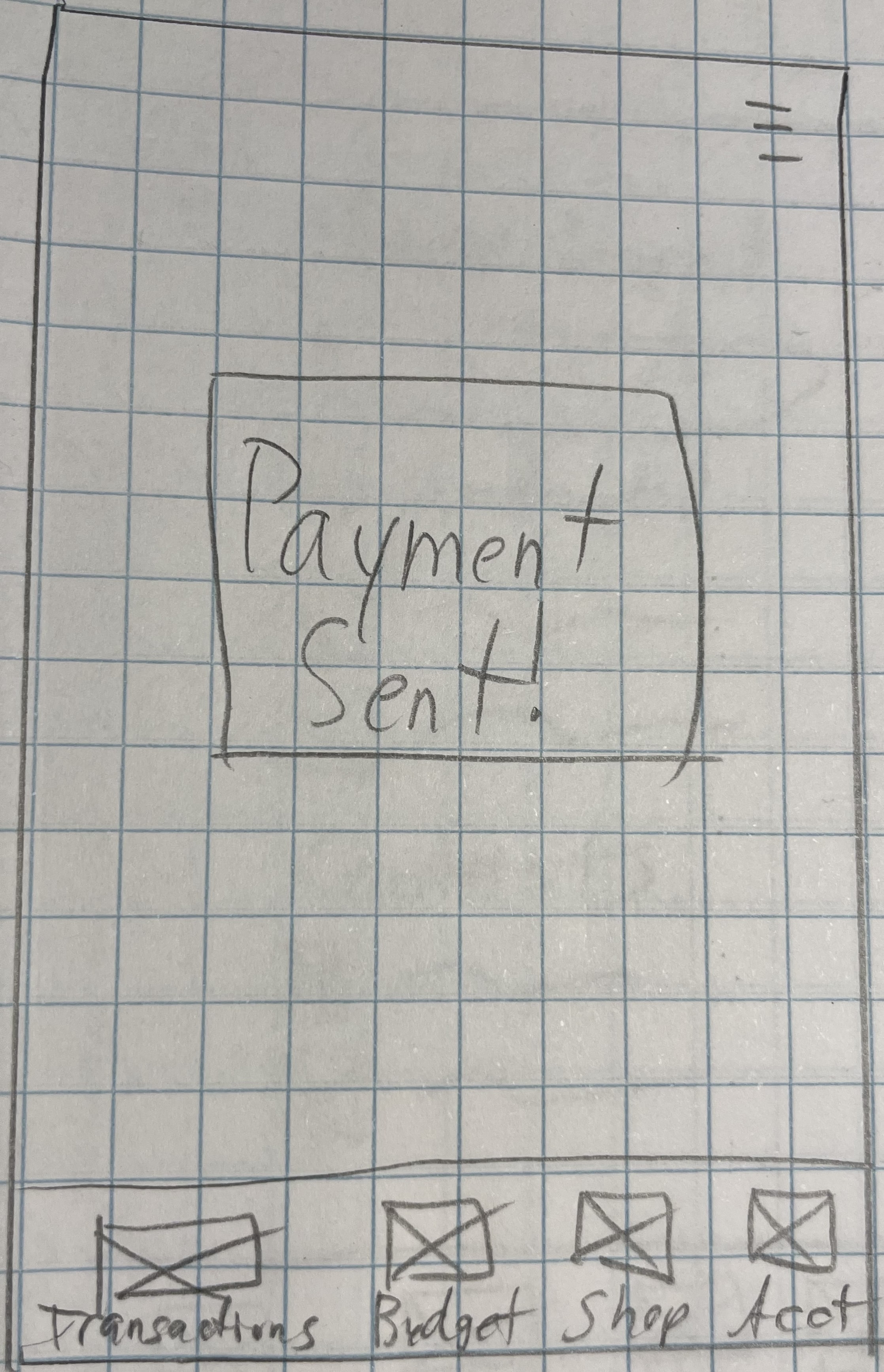
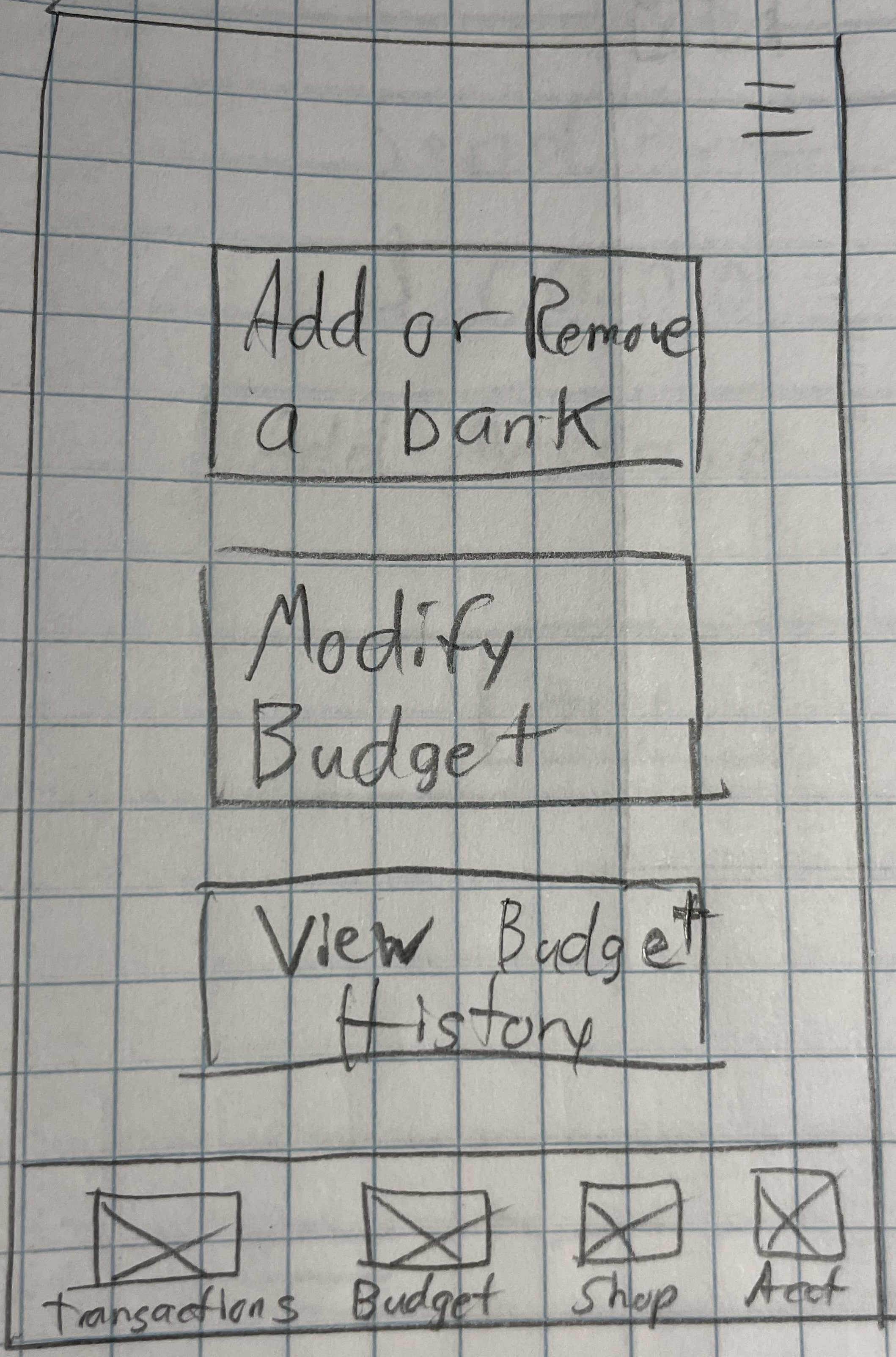
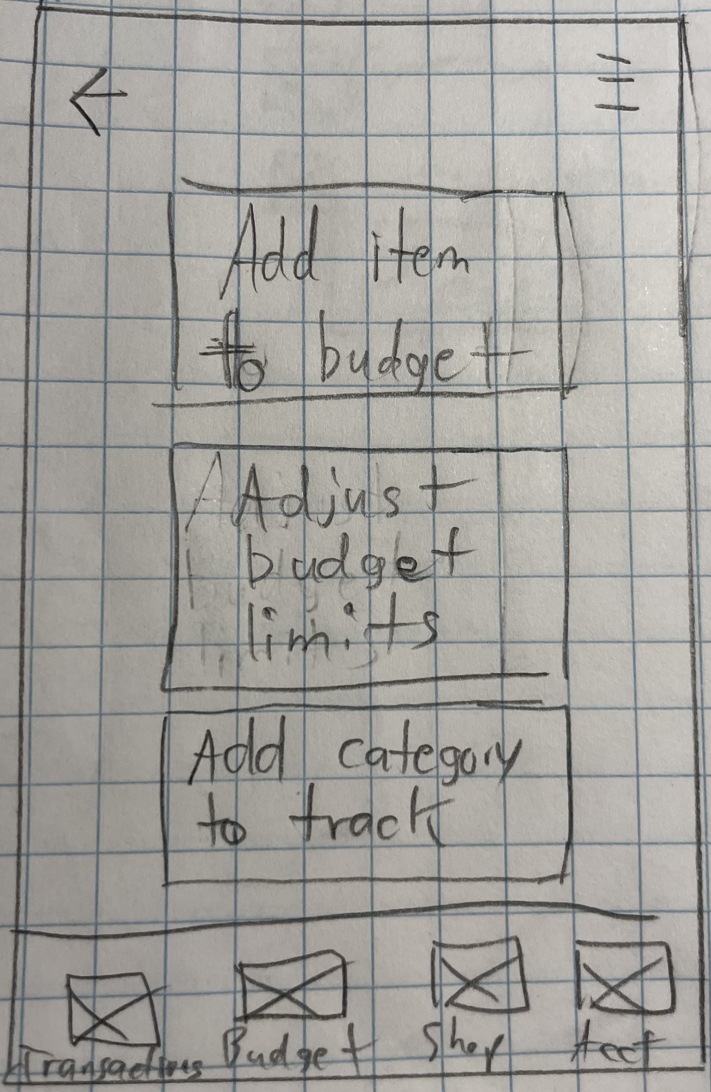
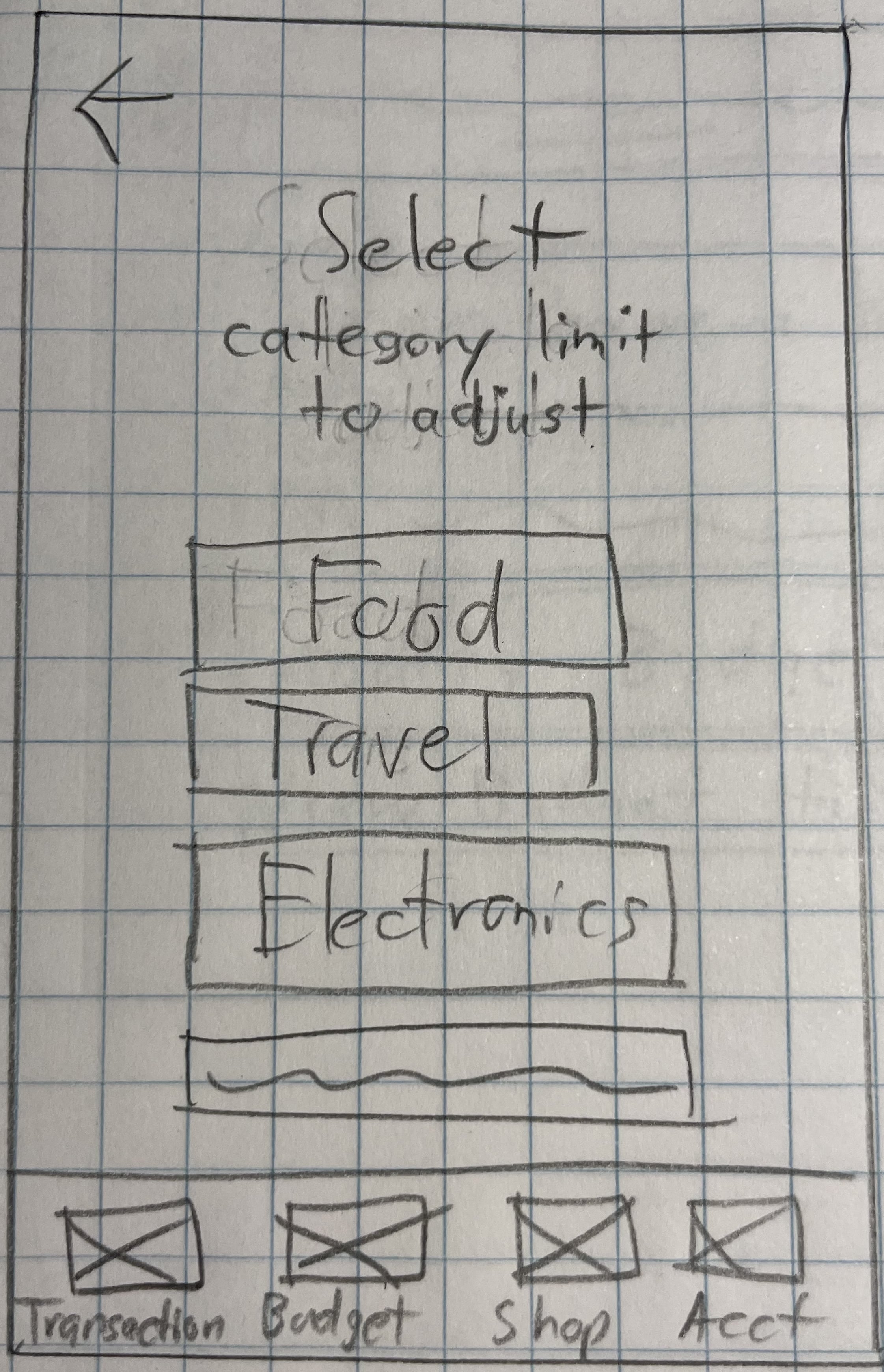
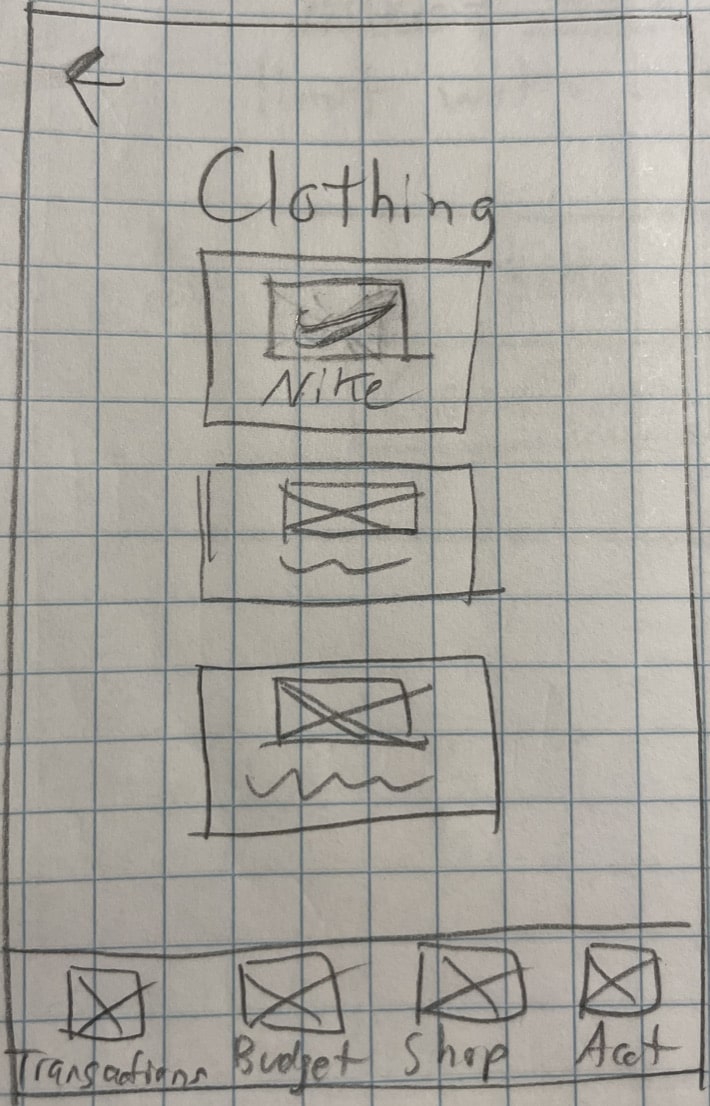
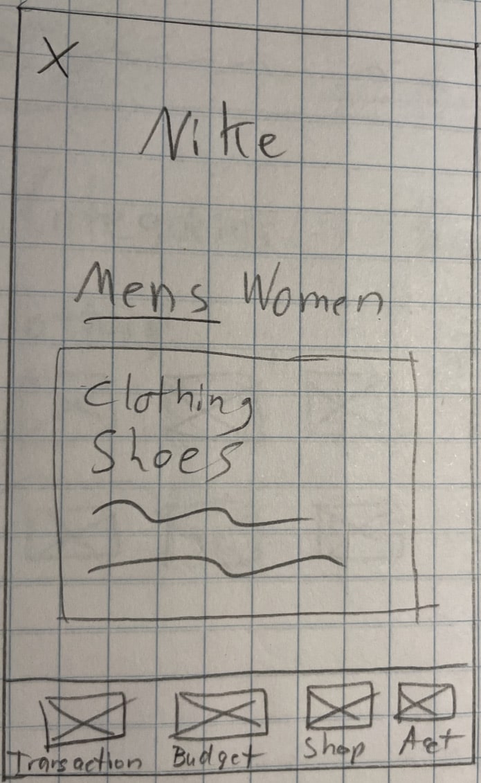
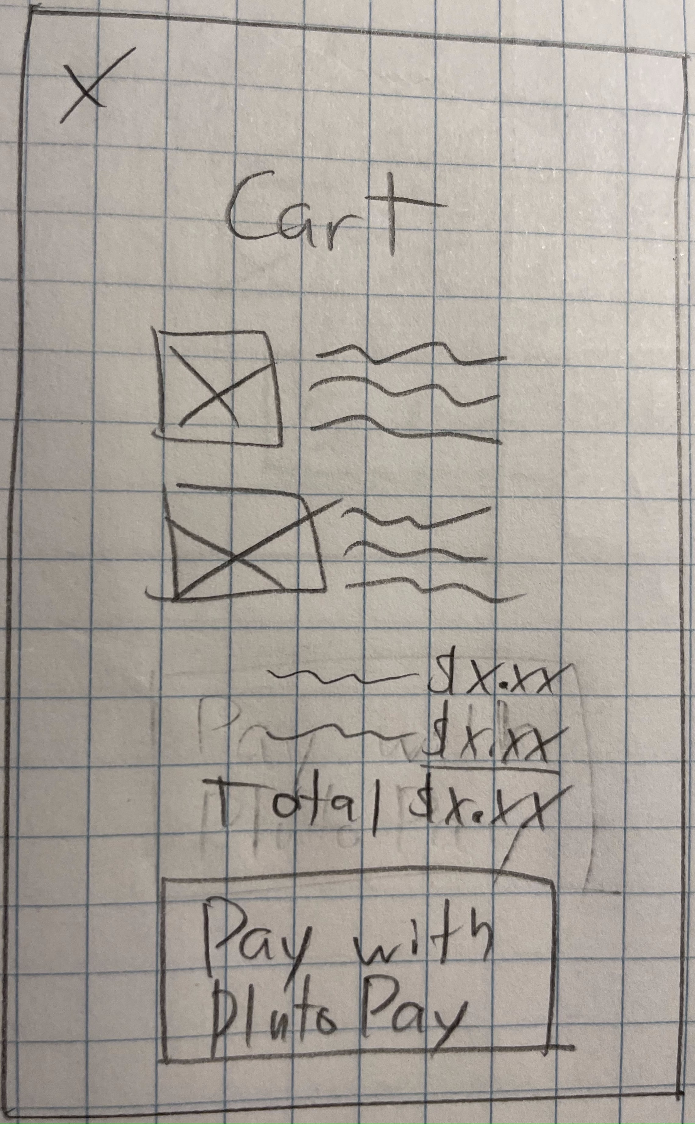
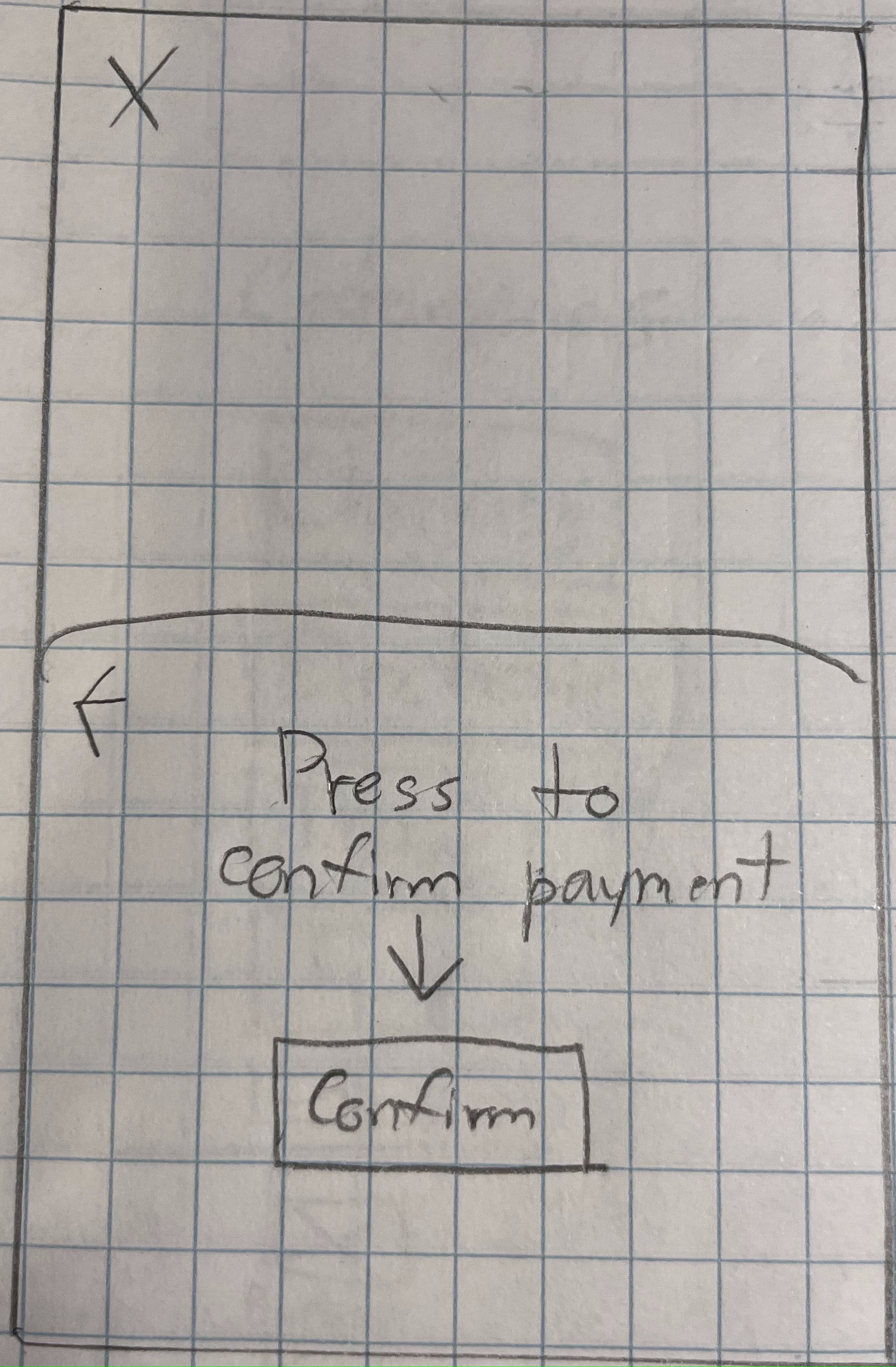
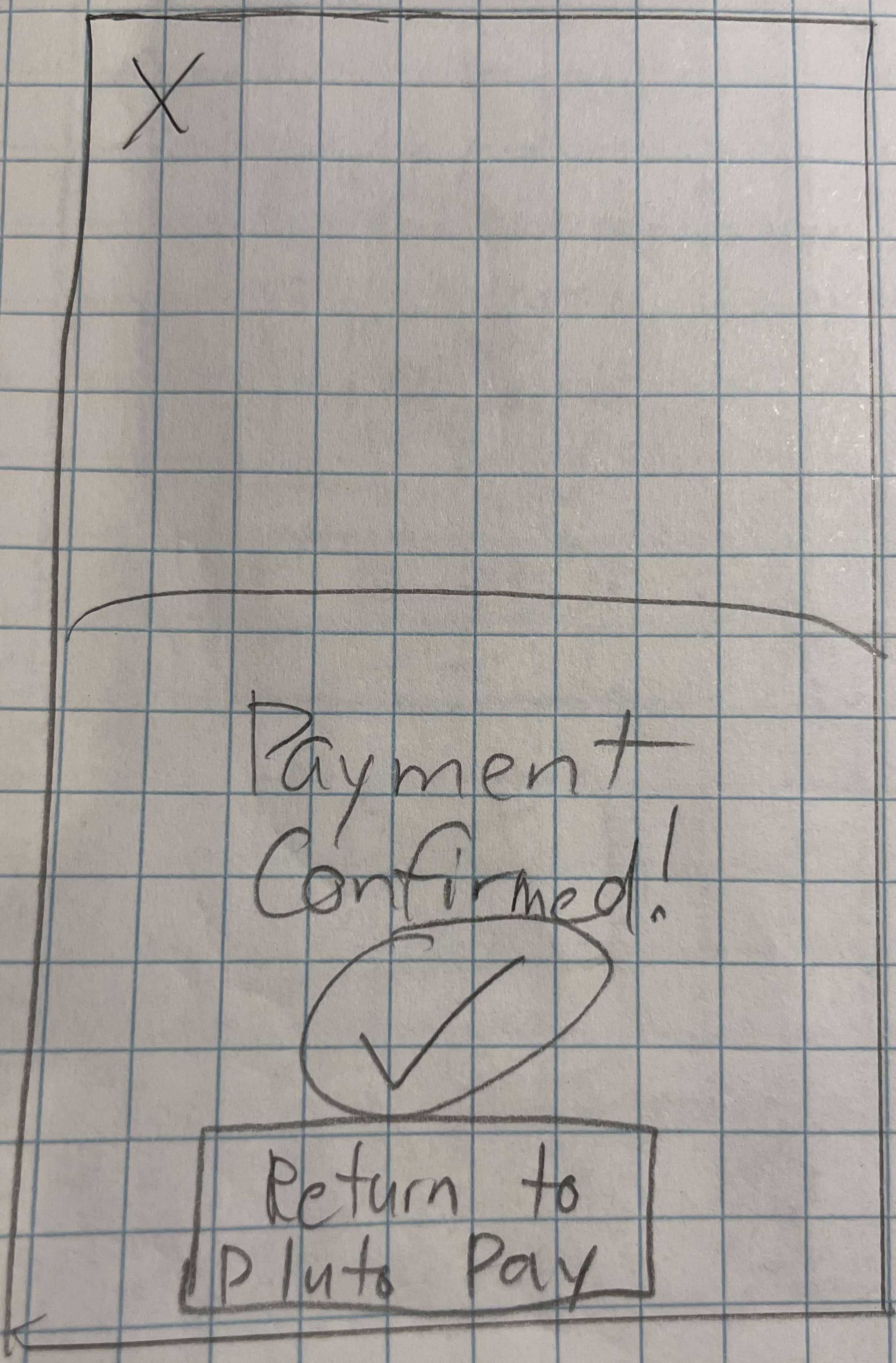
After creating some initial sketches, I decided to take the screens to Figma to improve upon the design. I started figuring out where to place elements on the screen, what language to use throughout the app, what fonts to use and what icons to utilize to start visualizing the direction to take my wireframes.

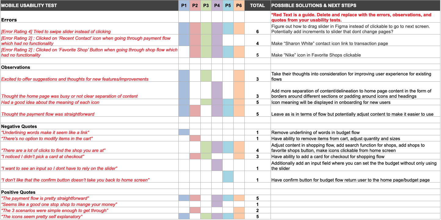
I conducted online usability tests with 6 participants with the following objectives:
All participants saw potential in the app, thought the features I designed made sense for the app and generally had a positive opinion on user flows.
In terms of issues with the app, there were a few usability issues that I had not considered which included:
Given the amount of information from the user testing sessions, I thought the best way to organize the results was to use an Affinity Map as well as a Rainbow Spreadsheet to rank the severity of certain issues.
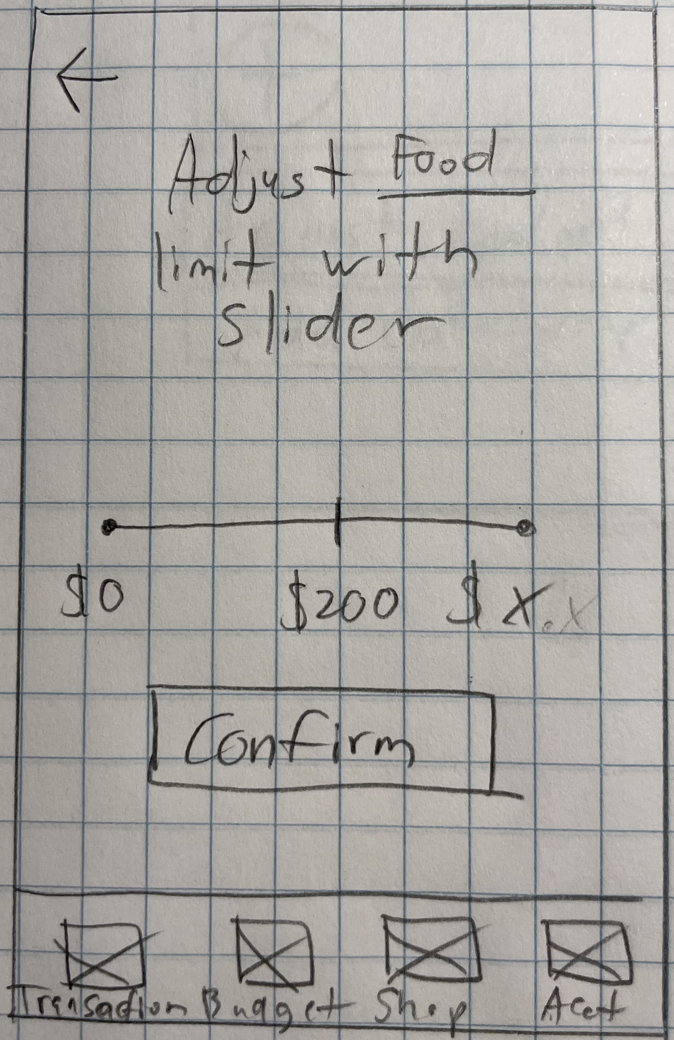
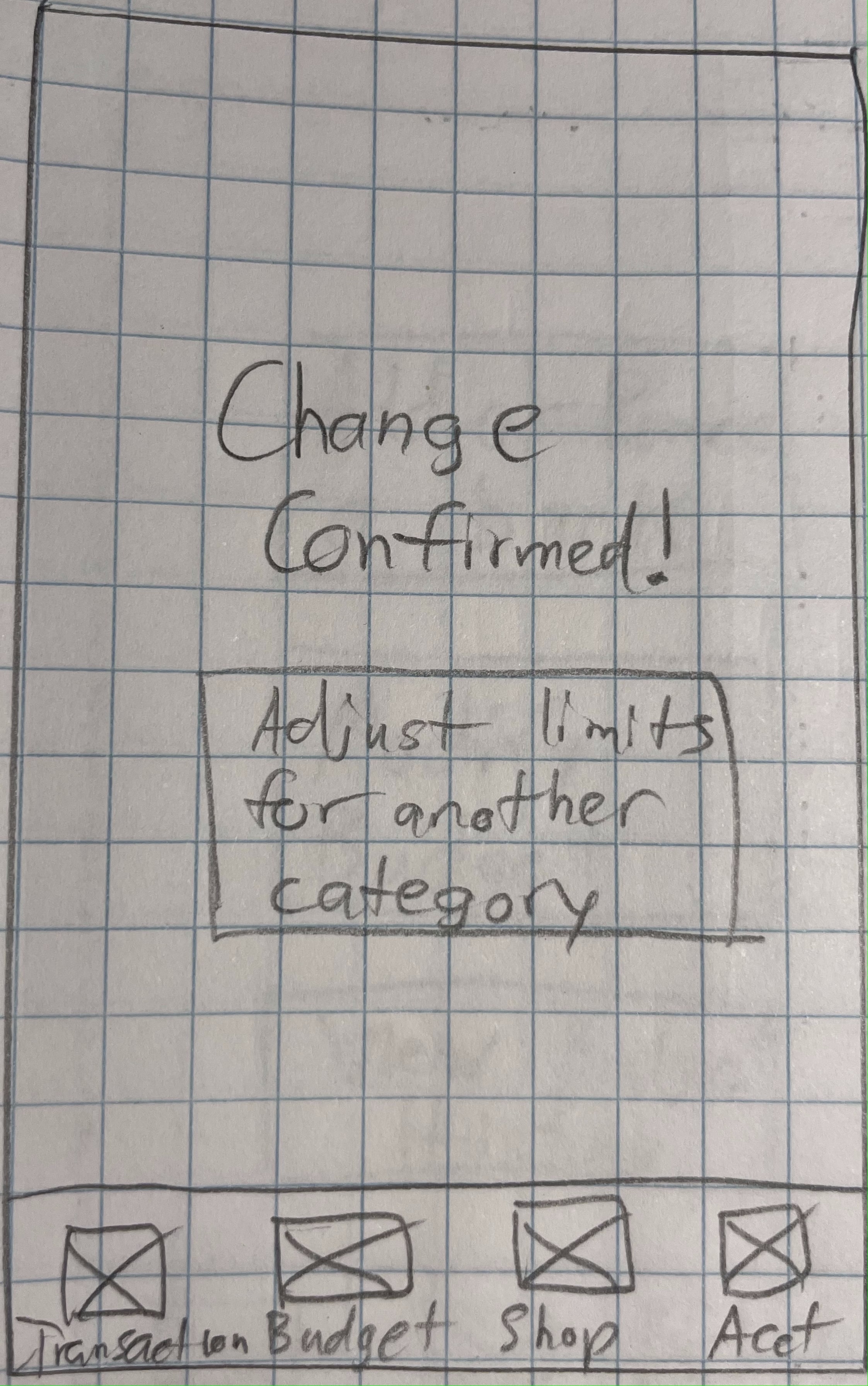
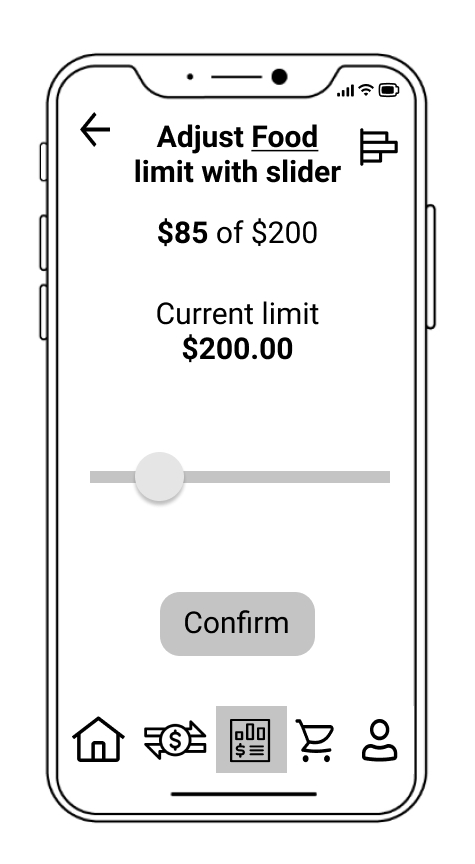
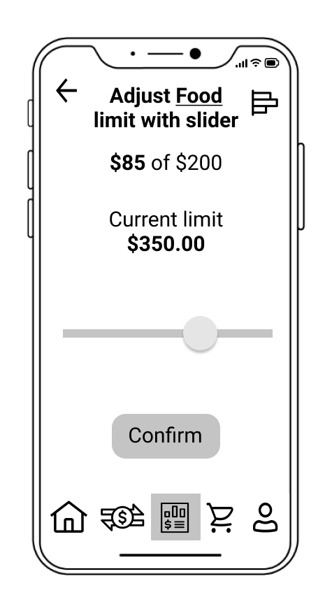
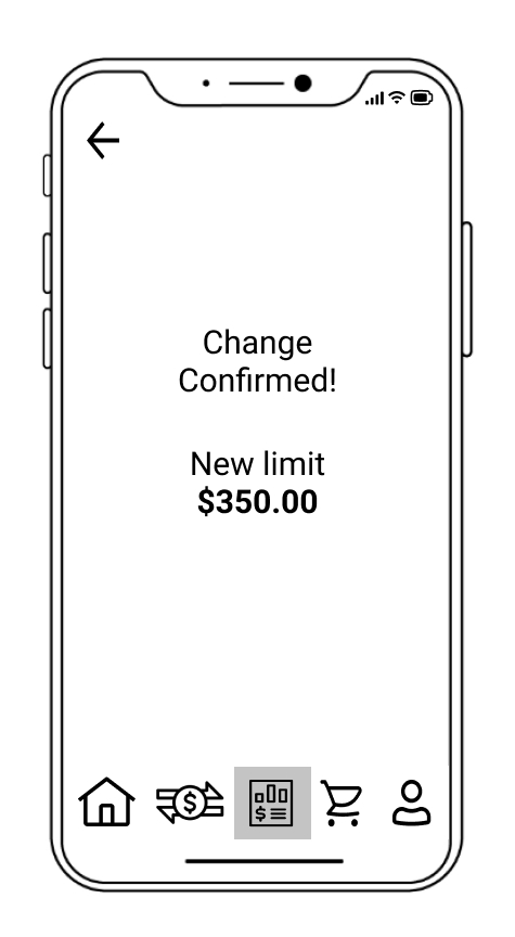
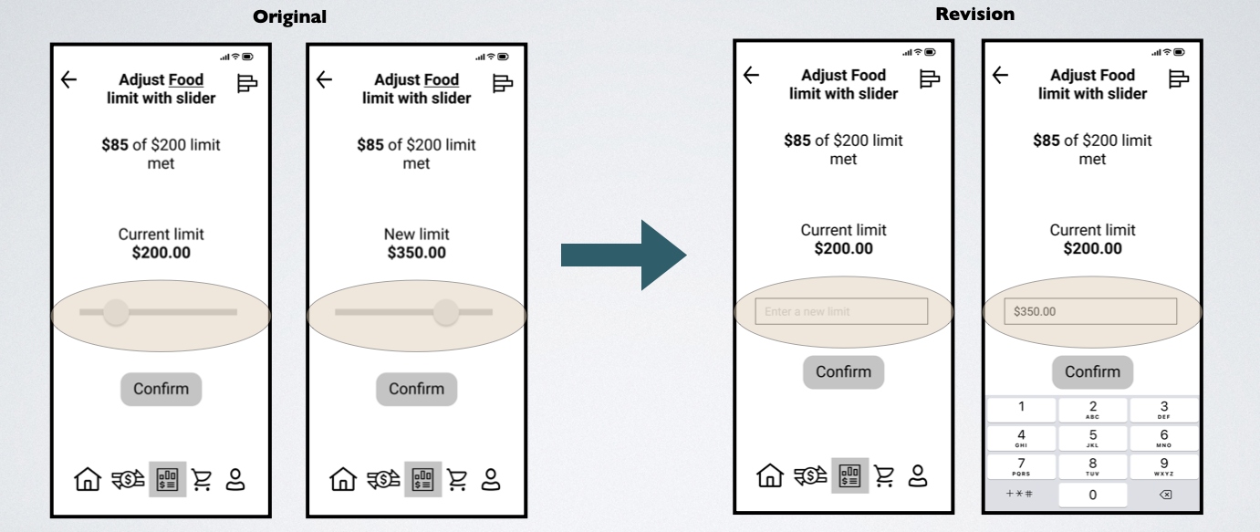
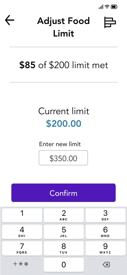
Change:
Changed slider to a text input field to adjust the limit.
Reason for Redesign:
Setting an upper bound for the slider as well as adjusting the number displayed based on slider position is a complicated functionality to add.
A text field allows users to select an exact number and is also easier to use than a slider which may require precise inputs to fine tune numbers.
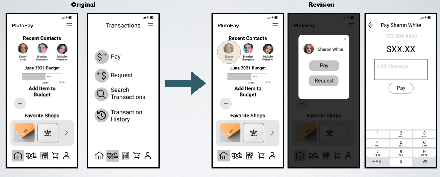
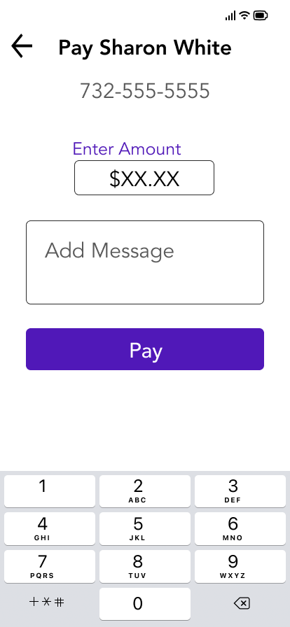
Change:
Made the “Recent Contact” icon link directly to a pay/request modal on home page.
Reason for Redesign:
The Recent Contacts icon for Sharon White is now clickable with a modal allowing the user to proceed farther into the payment flow directly from the home screen instead of having to click the transaction icon.
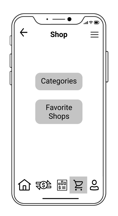
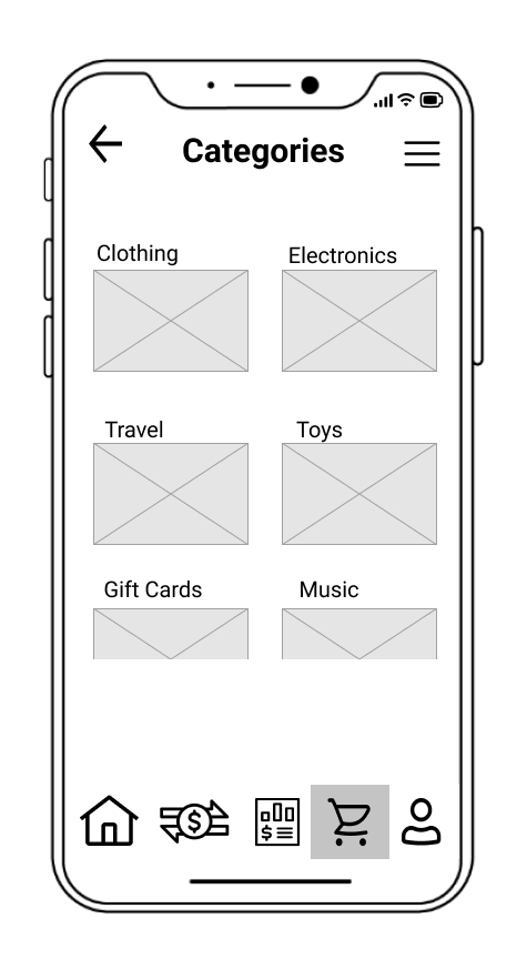
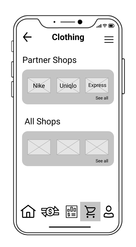
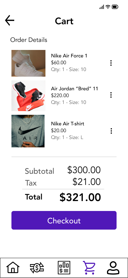
After testing the initial prototype and making changes based on user feedback, I took some time to work on the visual design of the application and developed a design system. The screens below show the evolution of some of the screens I designed going from low fidelity to high fidelity wireframes.
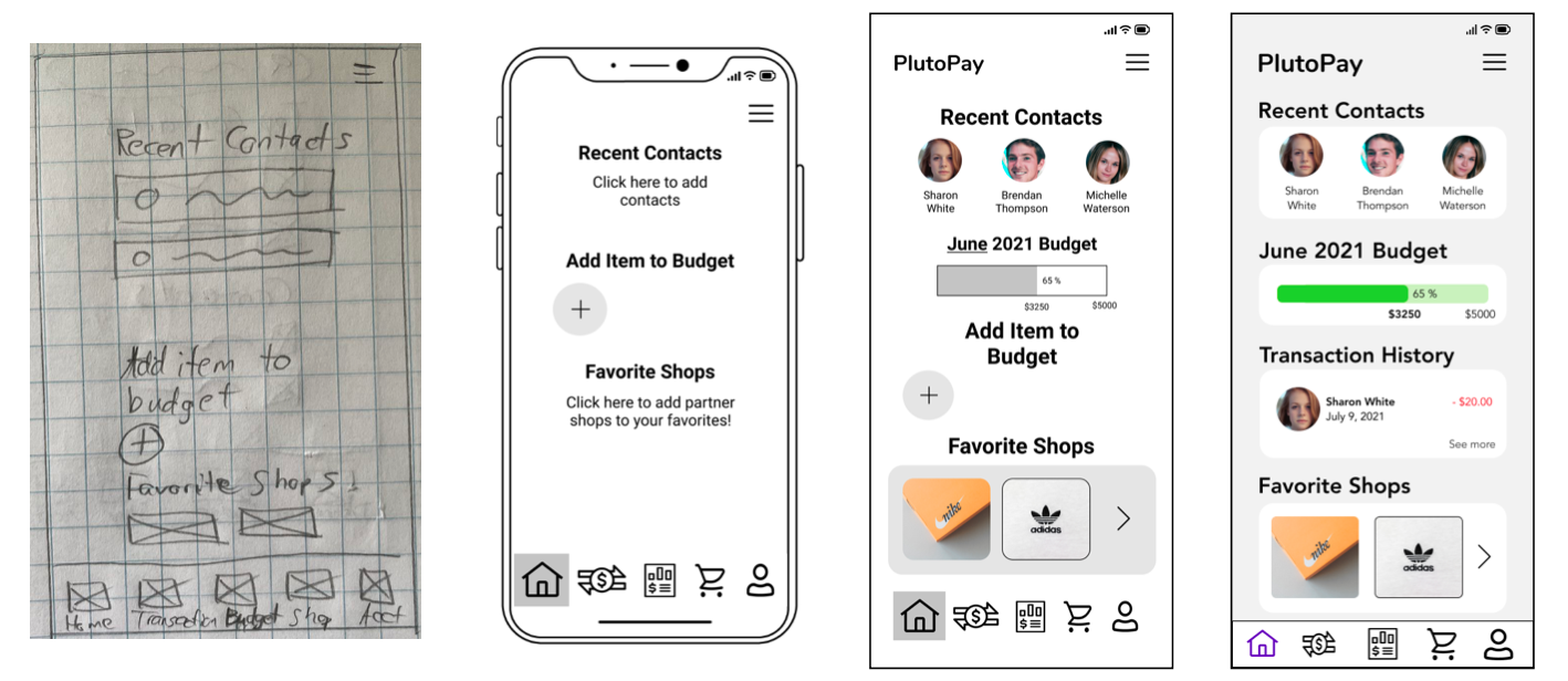
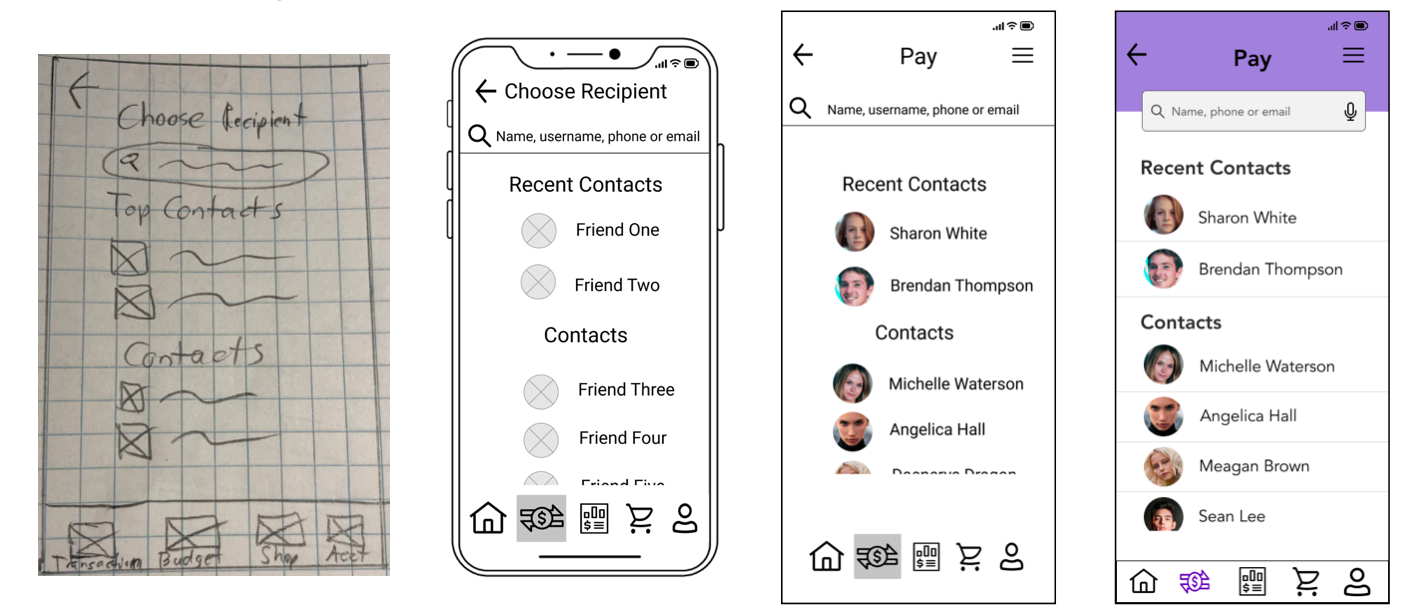
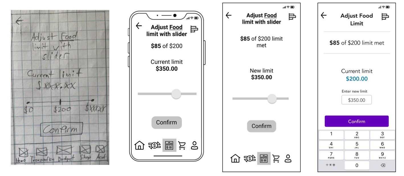
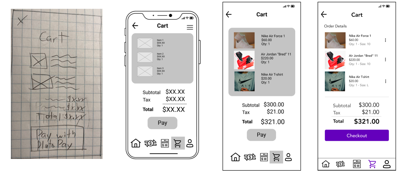
A big focus was made on choosing appropriate colors for the app to make it more visually appealing, using a column grid to properly layout elements and making use of white space in order to keep the screens looking minimal and clean. Accessibility in the form of addressing WCAG color contrast guidelines, following common mobile best practices and designing adequately sized touch targets was also addressed.
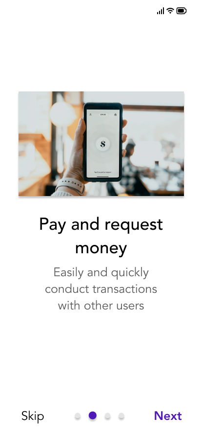
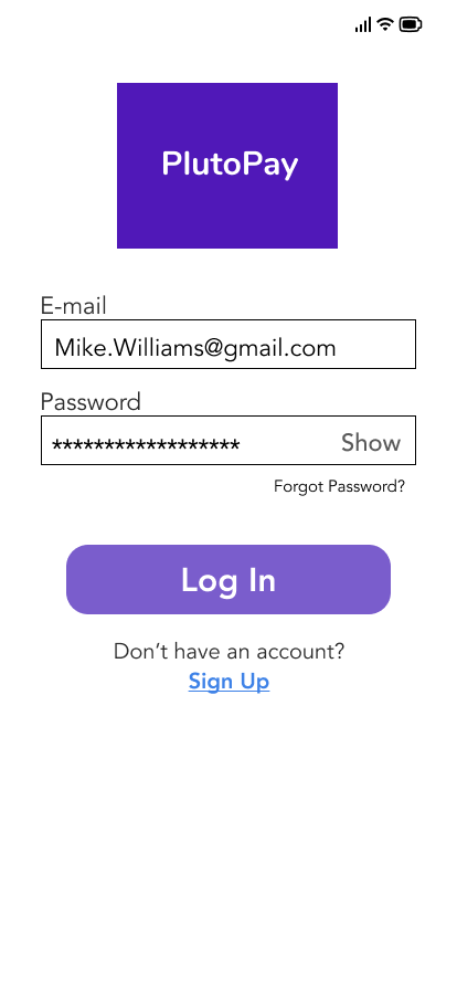
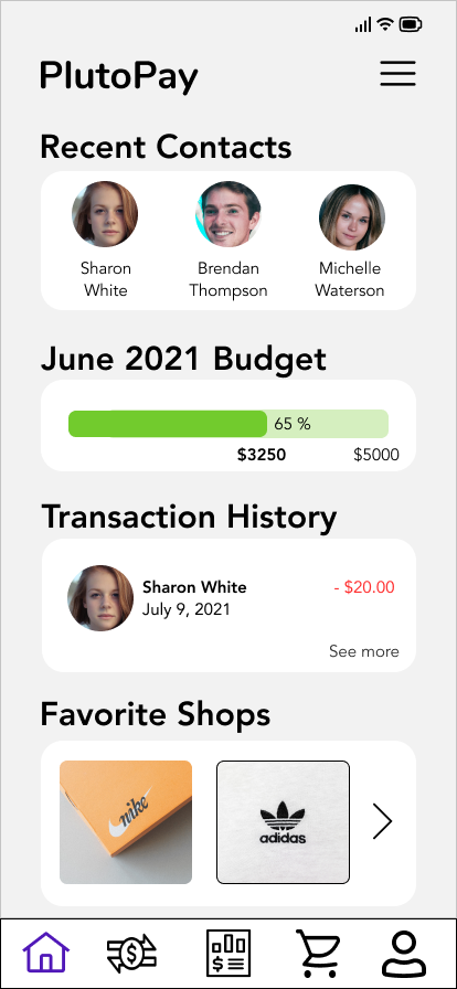
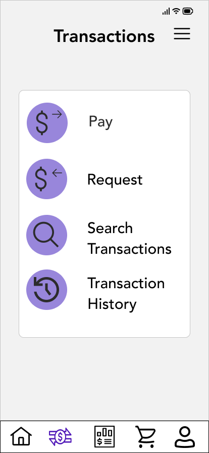
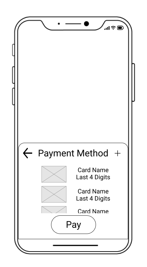
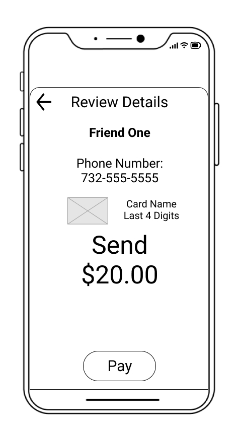
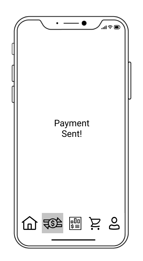
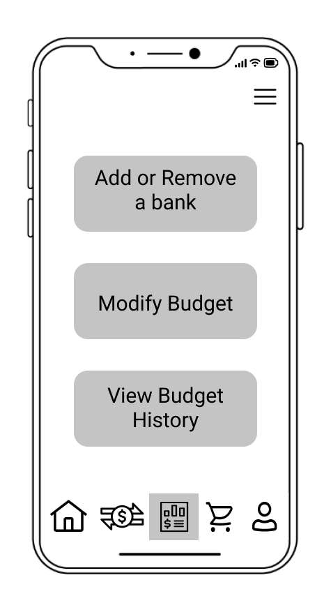
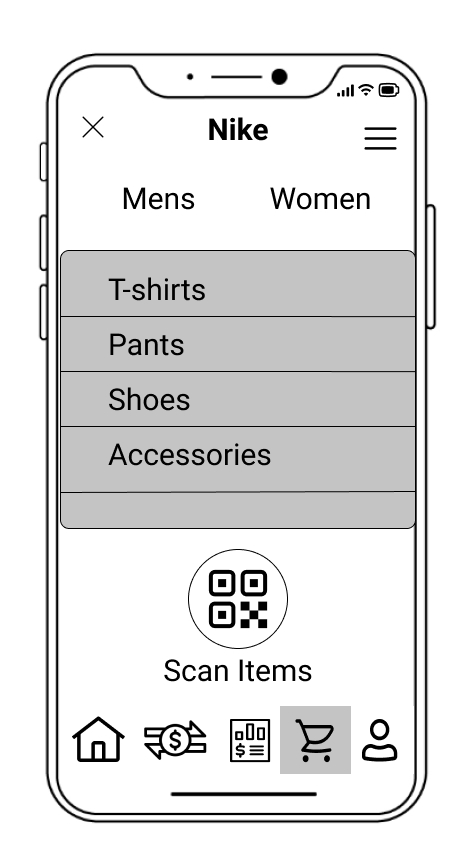
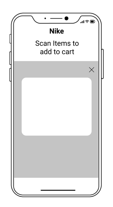
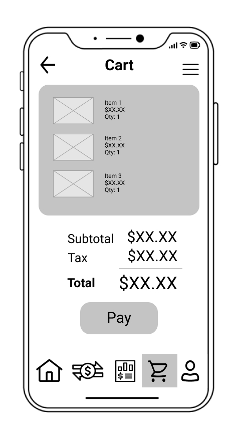
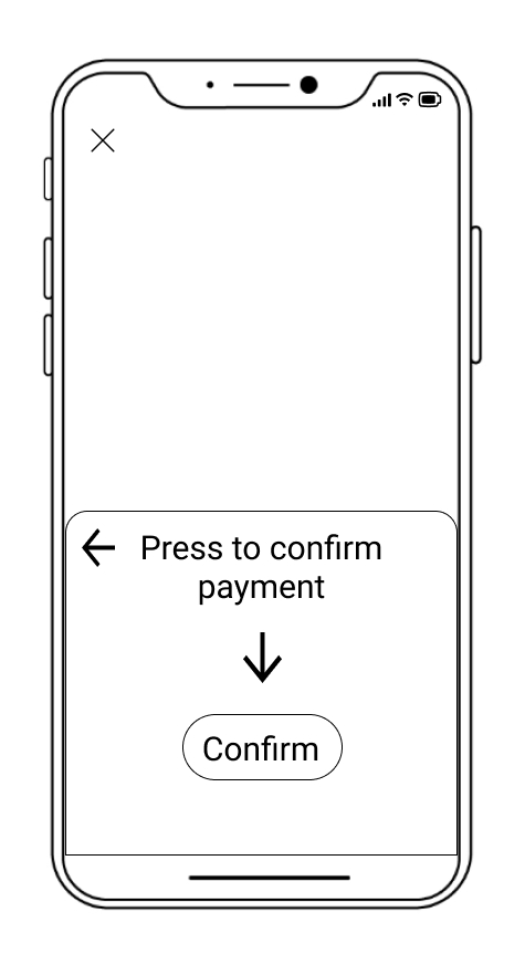
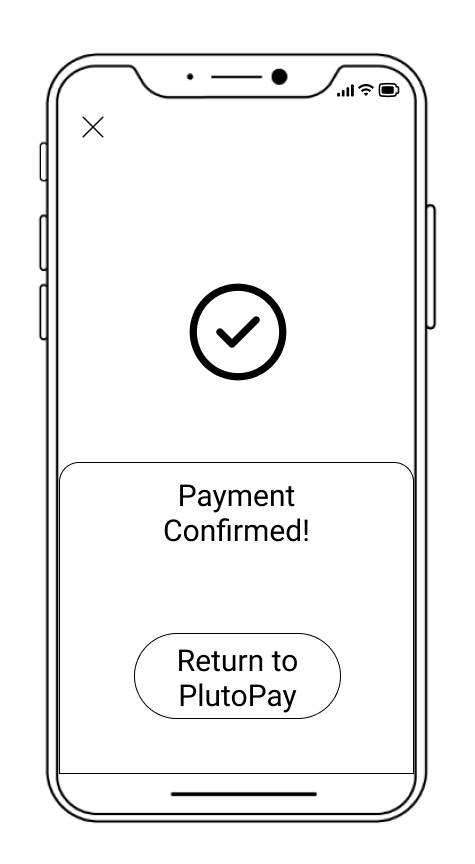
Ultimately my design process lead me to this Figma prototype below for PlutoPay.
For future iterations of the app, I would expand on the Onboarding section of my app to ask for information such as adding a credit card for PlutoPay and other personal information to get a user’s initial account created. I would also design a few screens for the Account section to have an idea of how I would layout components and structure the information.
I would conduct an additional round of user testing for the Onboarding and Account sections as well as another round of preference testing on my existing screens.
Considering the importance and prevalence of web applications, I would also design screens for the web version of PlutoPay. My mobile first approach would help me build upon the existing screens and create a design that is intuitive, responsive and useful for all screen sizes on a variety of platforms.
The entire process was filled with challenges and set backs, but also provided many learning opportunities. I learned about the importance of user research to discover problems and validate my assumptions. User testing of my prototype taught me the value of not being attached to your designs and being able to make changes to improve the user's experience.
Applying my design skills in a practical way, validating my design decisions through testing and going through the design process for PlutoPay from scratch to the final prototype was extremely rewarding. The skills I've refined and knowledge I built from this case study will carry me forward in my UX journey.