
Getting into a consistent fitness routine is difficult. Creating a workout plan that fits a person's level, exercise interests and sticking to a schedule that works is a time consuming process especially when first starting out. User's need a way to not only find, but stick to a routine that helps them achieve their fitness goals on their own time.
With some of the initial user research already complete. I focused on using the following User Stories to guide the features I would design:
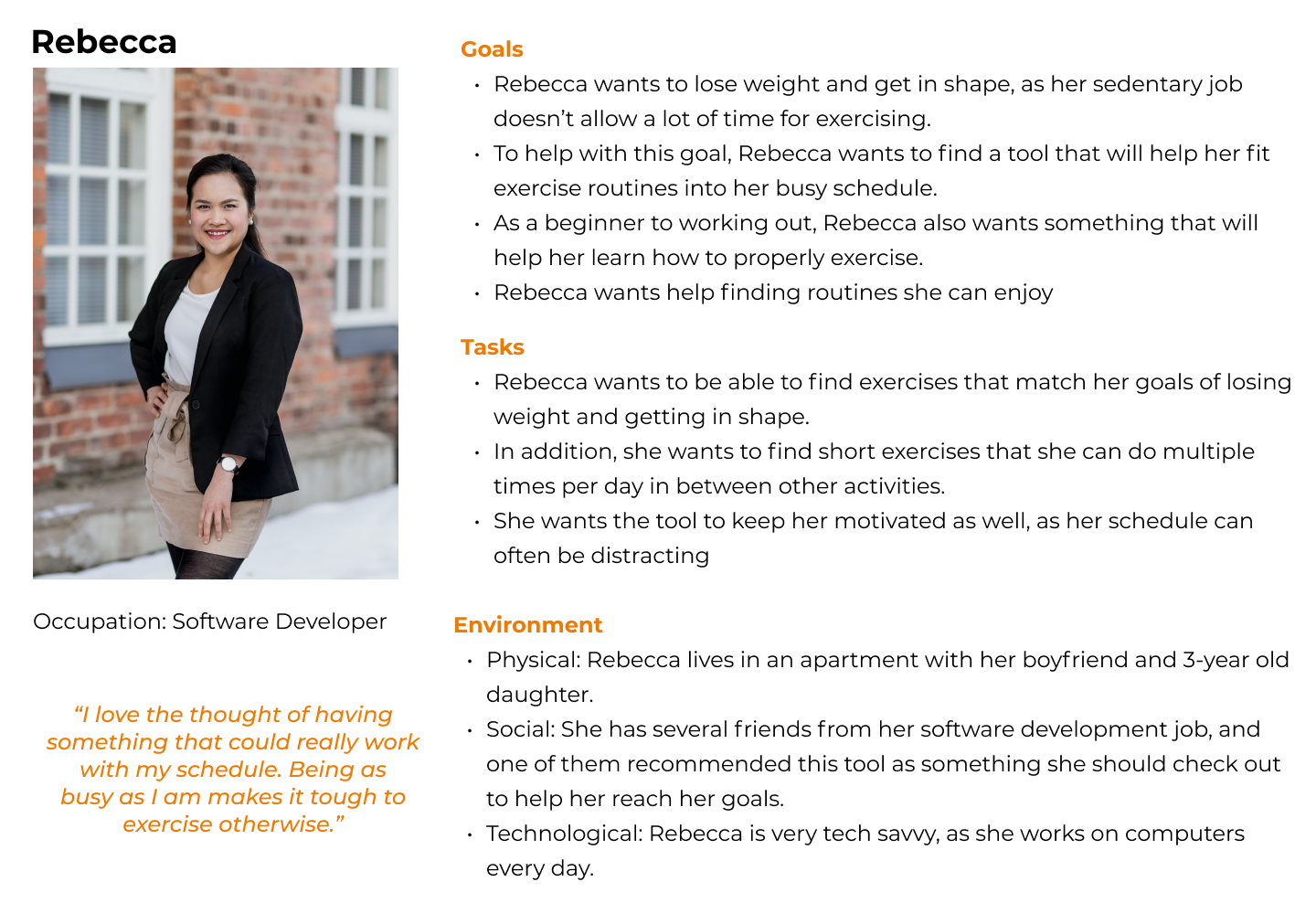
Using the user stories as a guide, Rebecca became the ideal person that would I would design for.
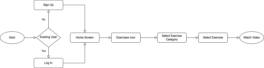
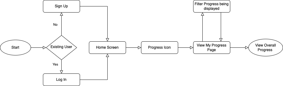
Given Rebecca's goals and tasks she wants to complete, the following flows were created.
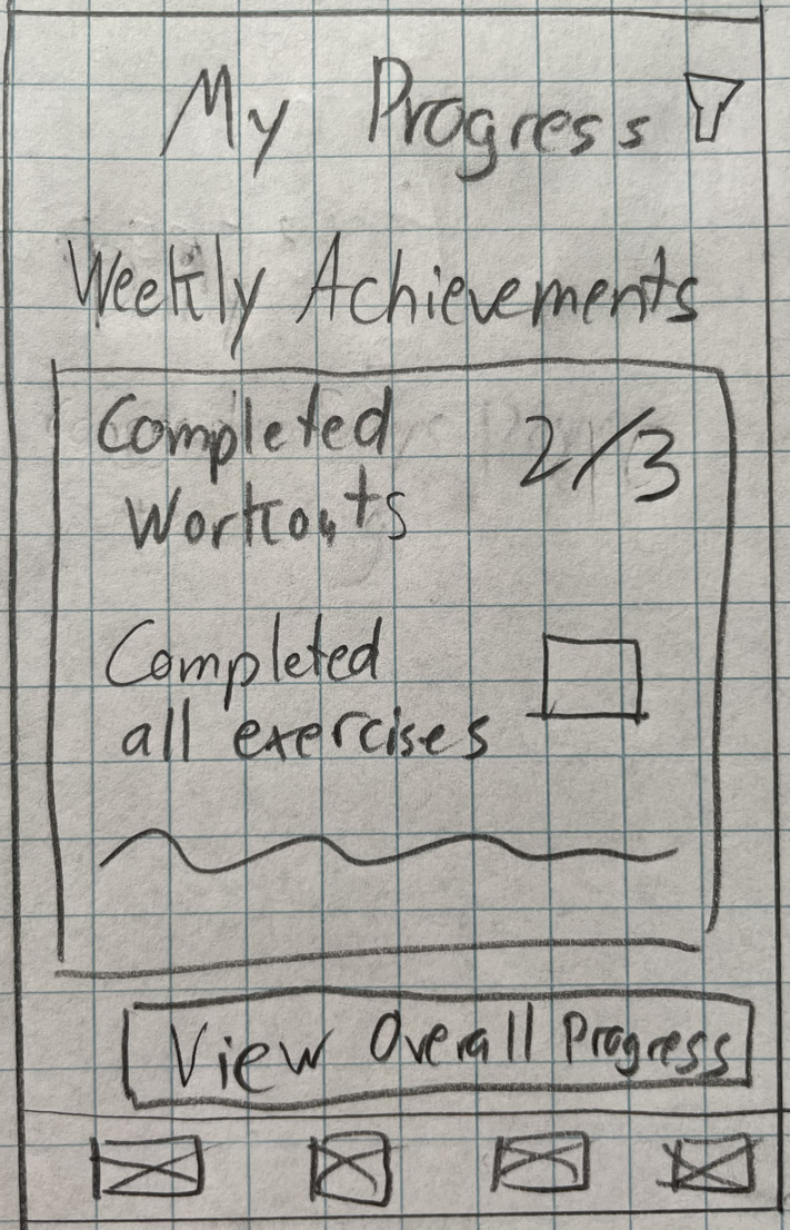
Within each flow I added steps that I thought would be intuitive for the user such as selecting what days to apply the workout plan to in the Schedule a Workout user flow and giving the user the ability to filter the results that display on the screen for the Tracking Progression flow.

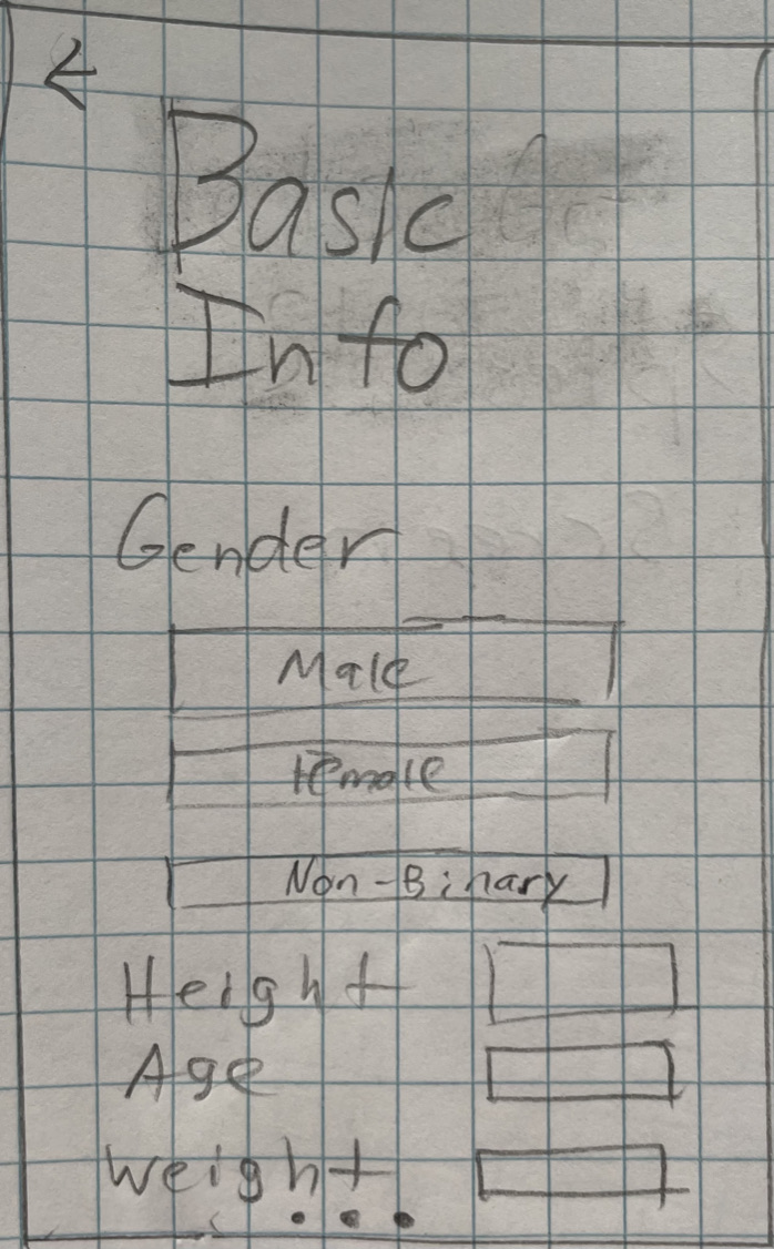
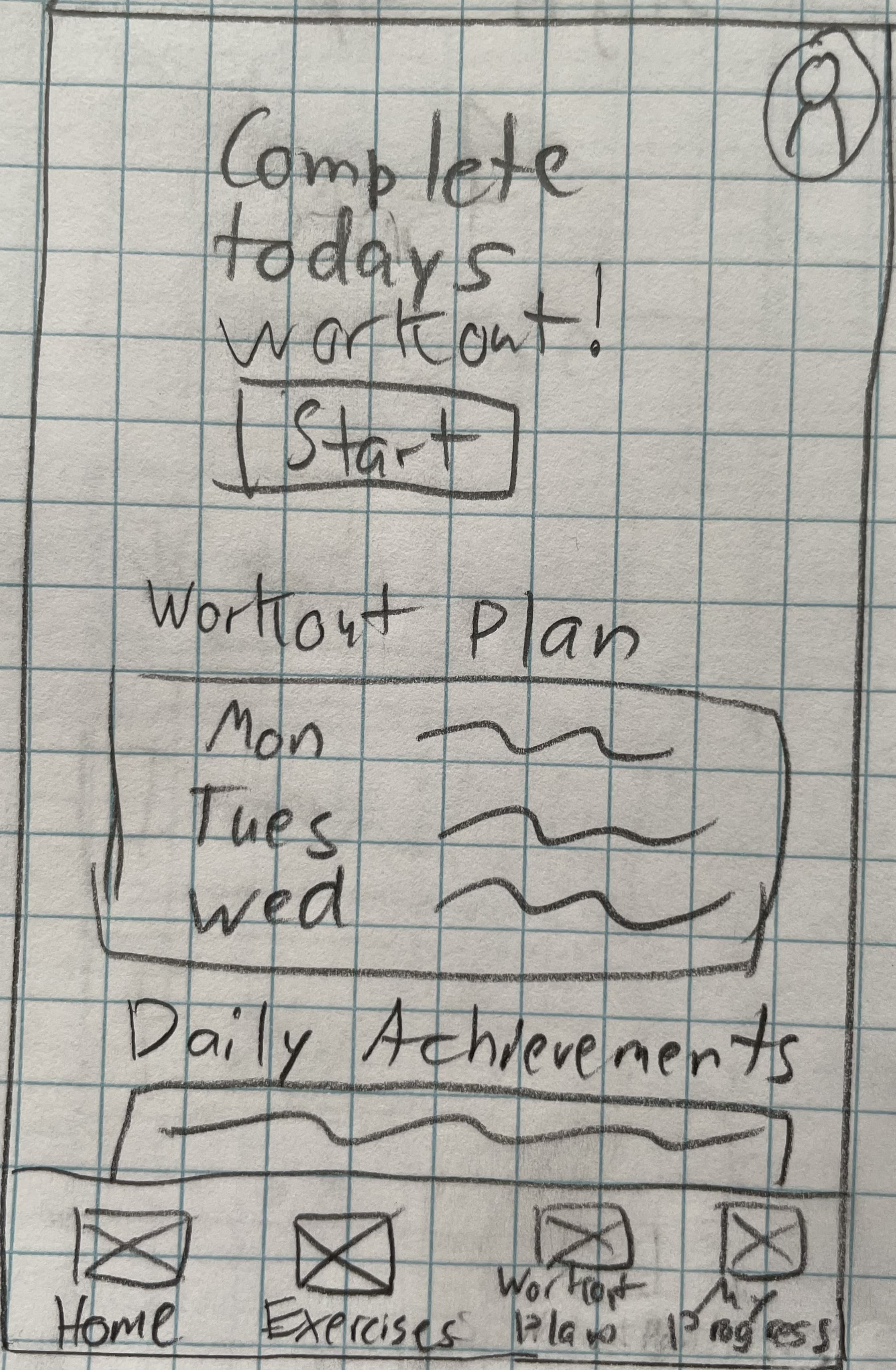
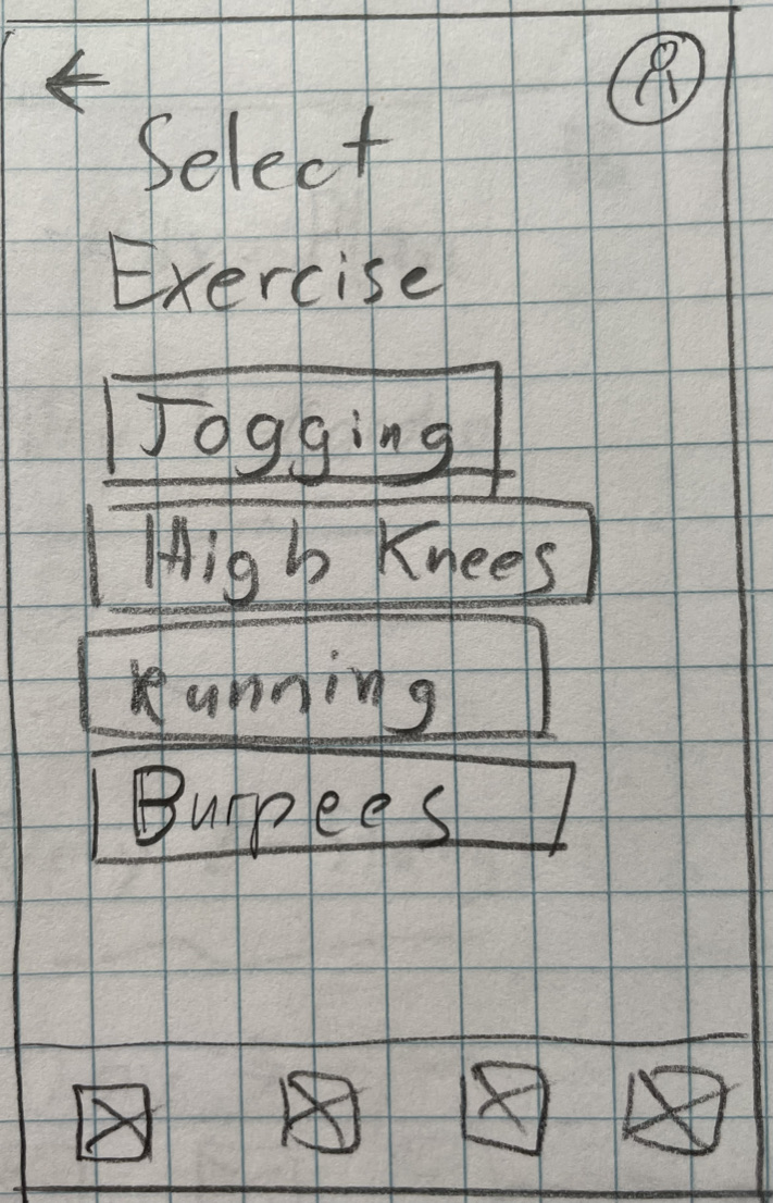
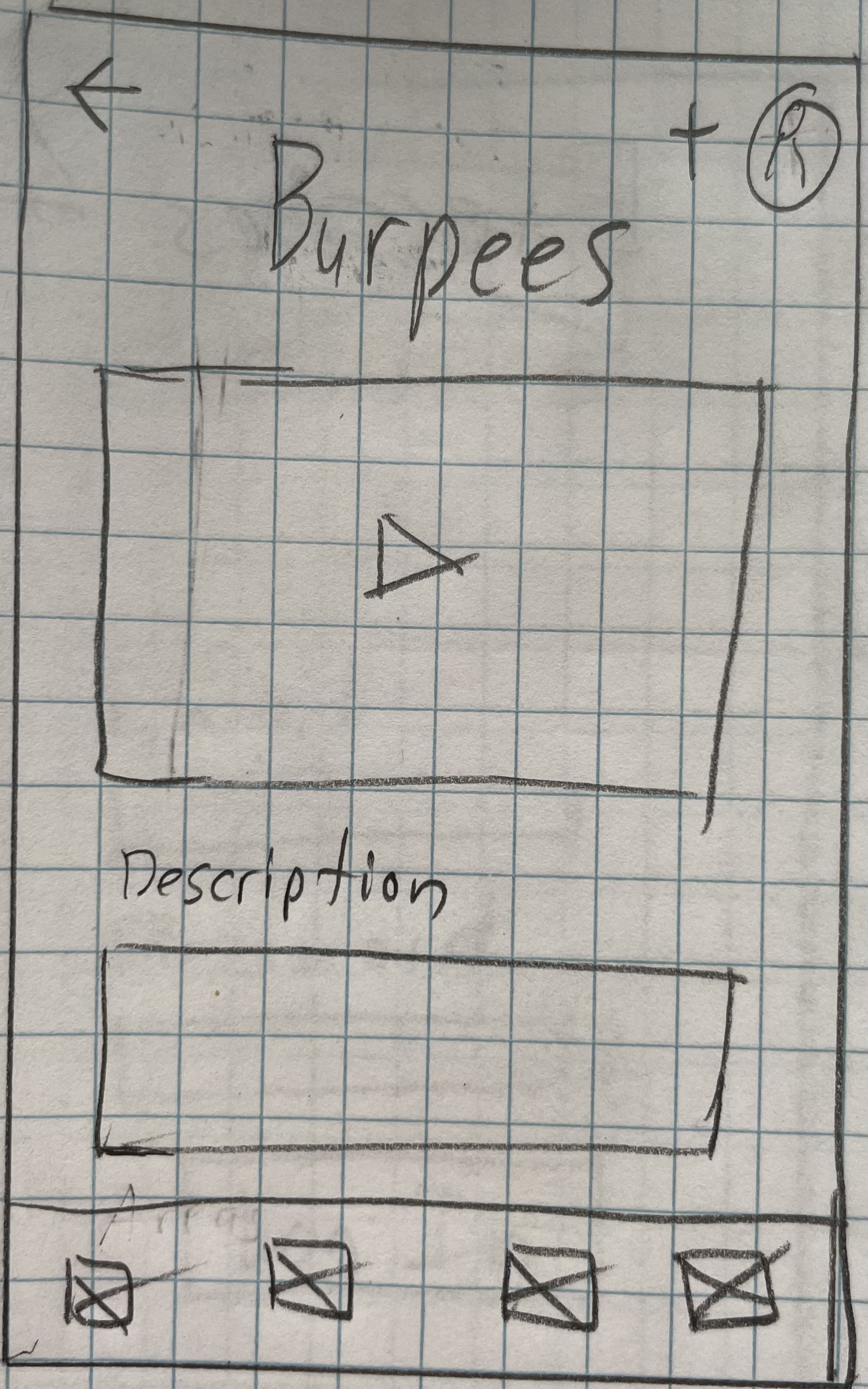
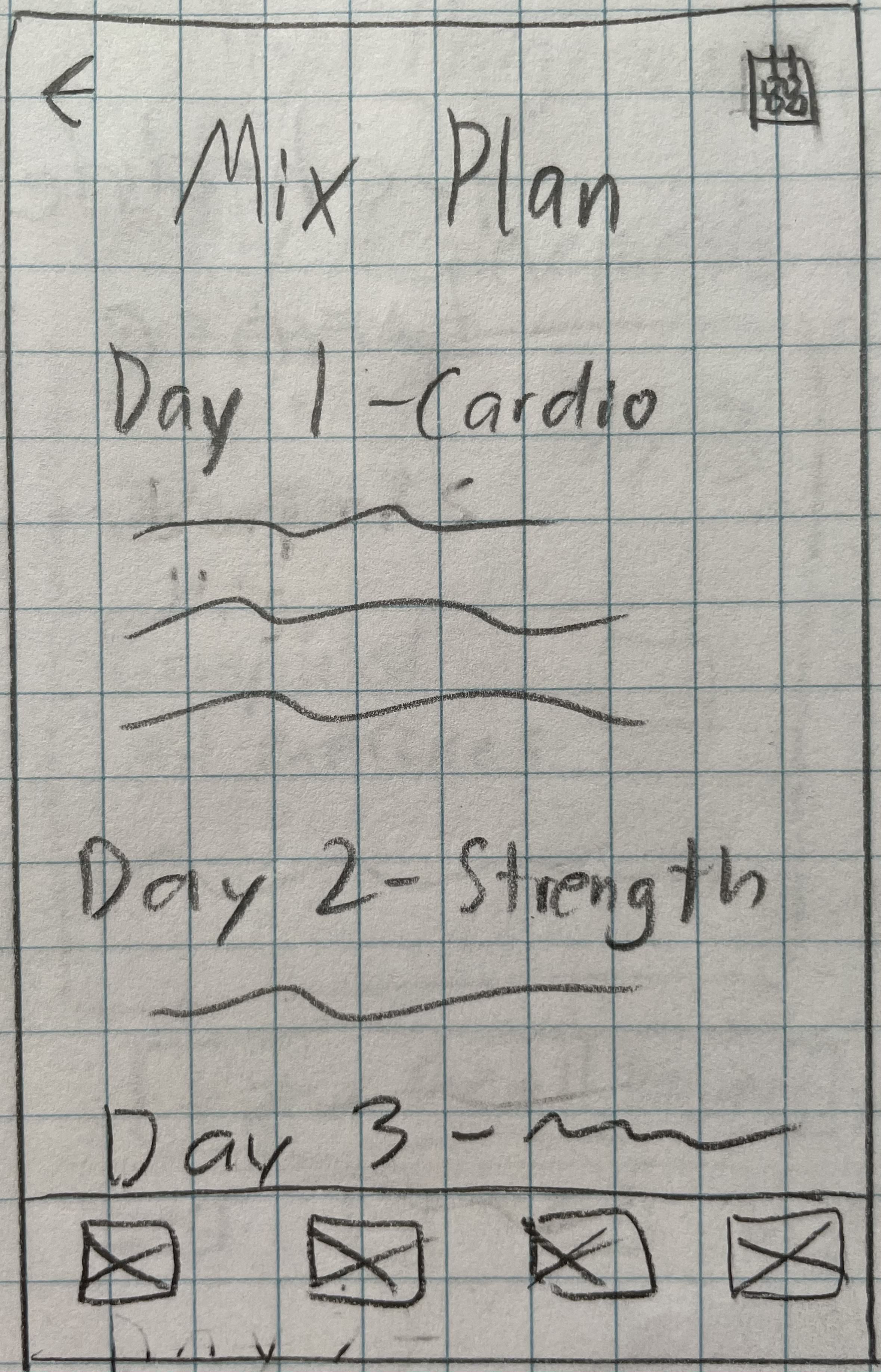
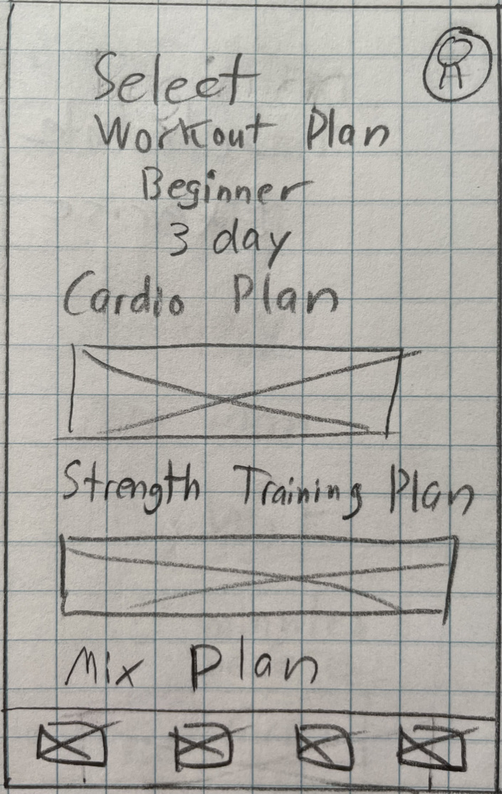
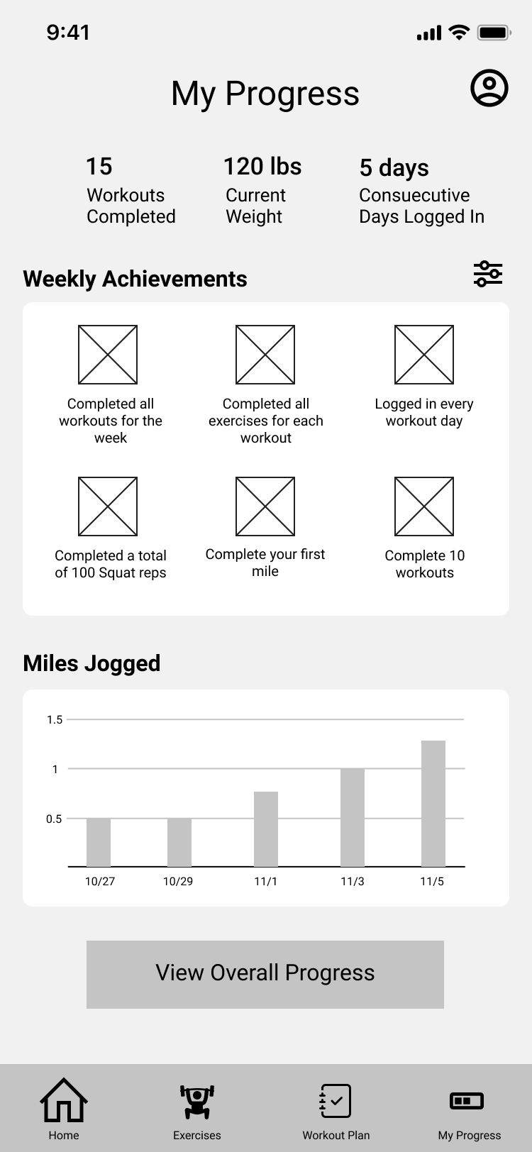
Using my user flows as a guide I sketched some low fidelity wireframes. I focused on the rough layout of different elements on each screen and displaying content and information that would be useful for fitness.
My next step was to determine the color palette, typography, iconography, imagery and other visual design elements of the app. I chose Proxima Nova and Open Sans since they are simple and mature looking typefaces that compliment each other and focused on using a consistent line weight and an outline style for the app's icons.
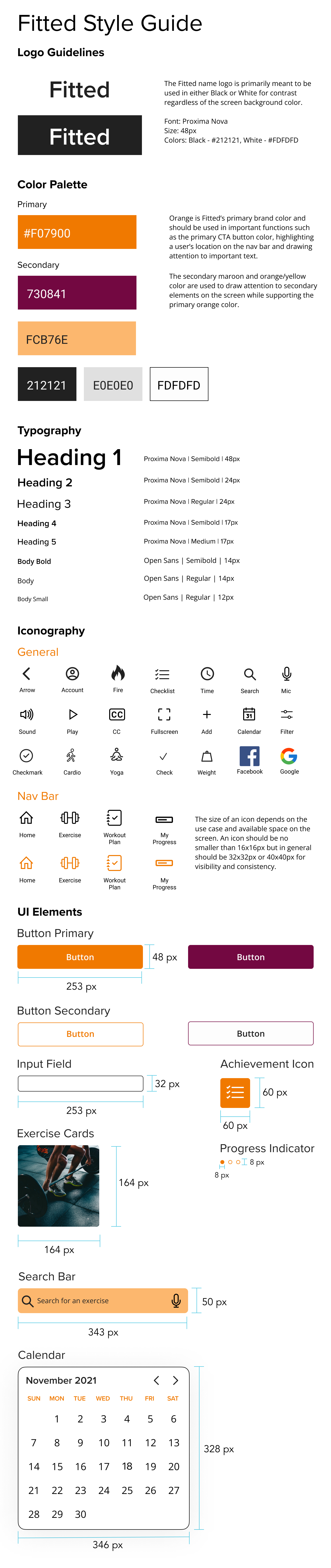
For the full style guide refer to the link here: Fitted Complete Style Guide
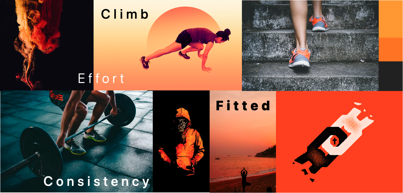
In order to draw inspiration for the app I decided to create a mood board using the desired black and orange colors from the project design brief. The intention of the board was to create an experience that invokes feelings of motivation and effort while still being fun and not overly intense.
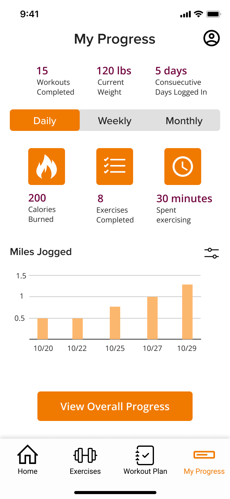
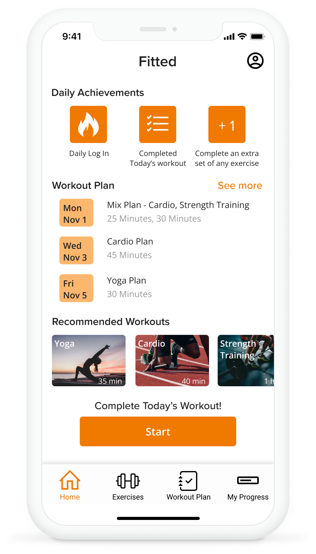
Once I created the style guide, I then applied various forms of styling to design the High Fidelity Wireframes. The goal of each screen was to create a consistent look that adhered to common design principles while maintaining a strong visual hierarchy.
For this screen I was given feedback to keep all the corners rounded for the buttons, cards, and icon backgrounds. This reinforced the idea of consistency which overall makes the look of the screen cleaner.
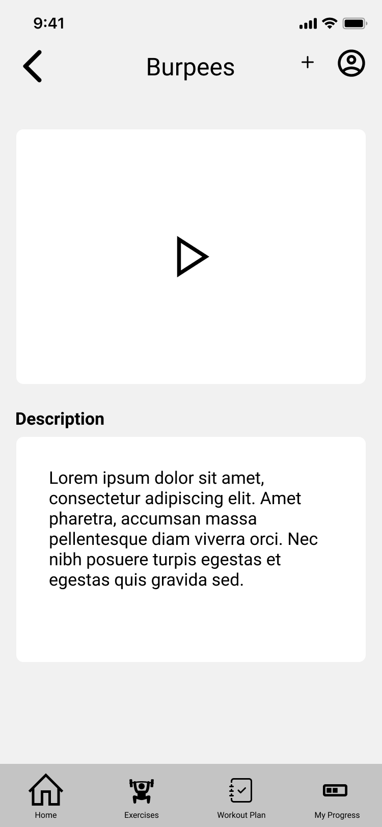
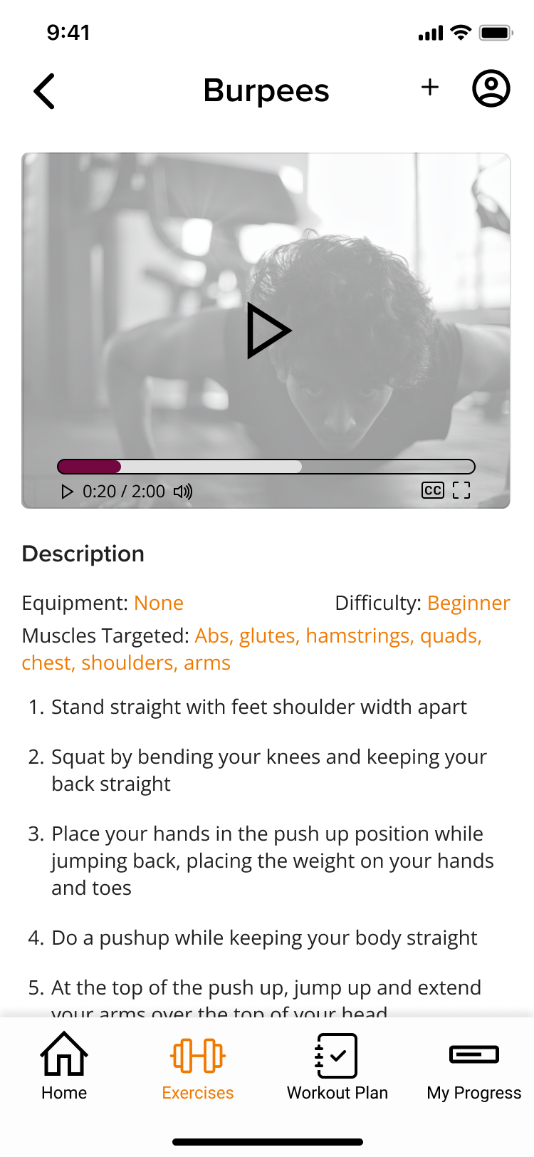
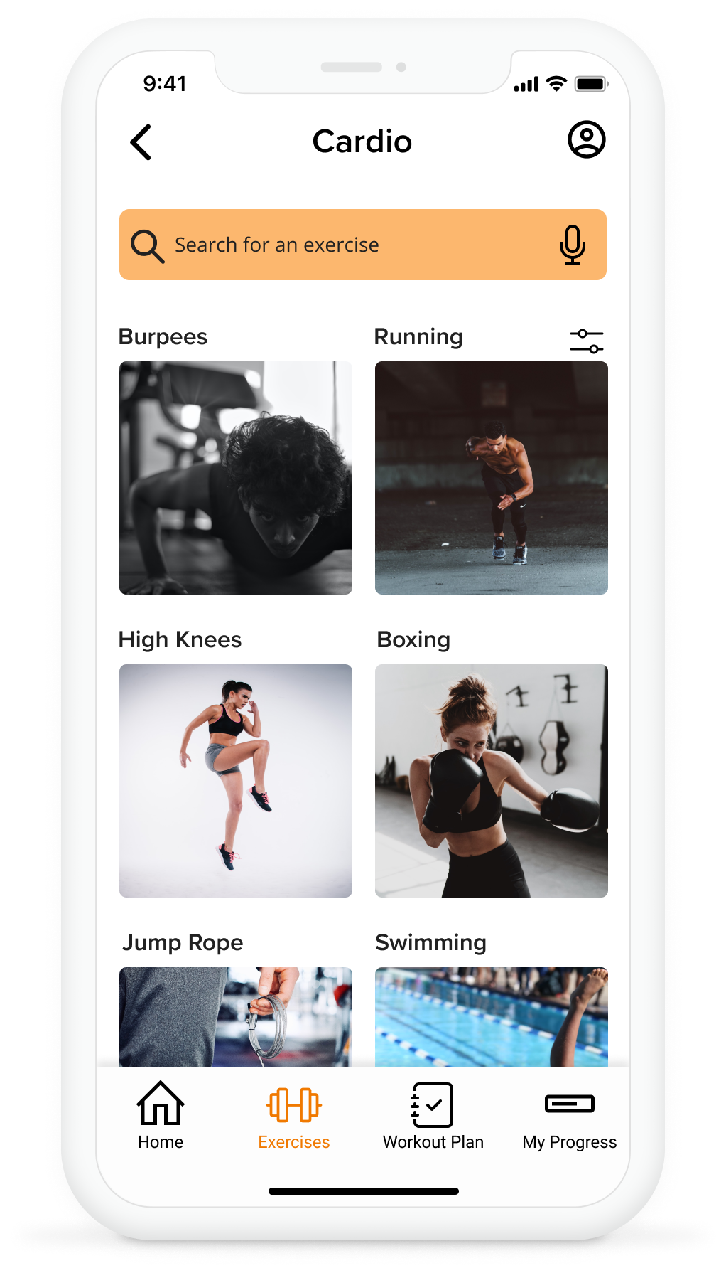
When redesigning the View Exercise screen I was given feedback regarding color and proper spacing of text throughout the screen to improve legibility. For the player itself I made sure to add important information such as video duration, volume, and CC to address accessibility concerns.
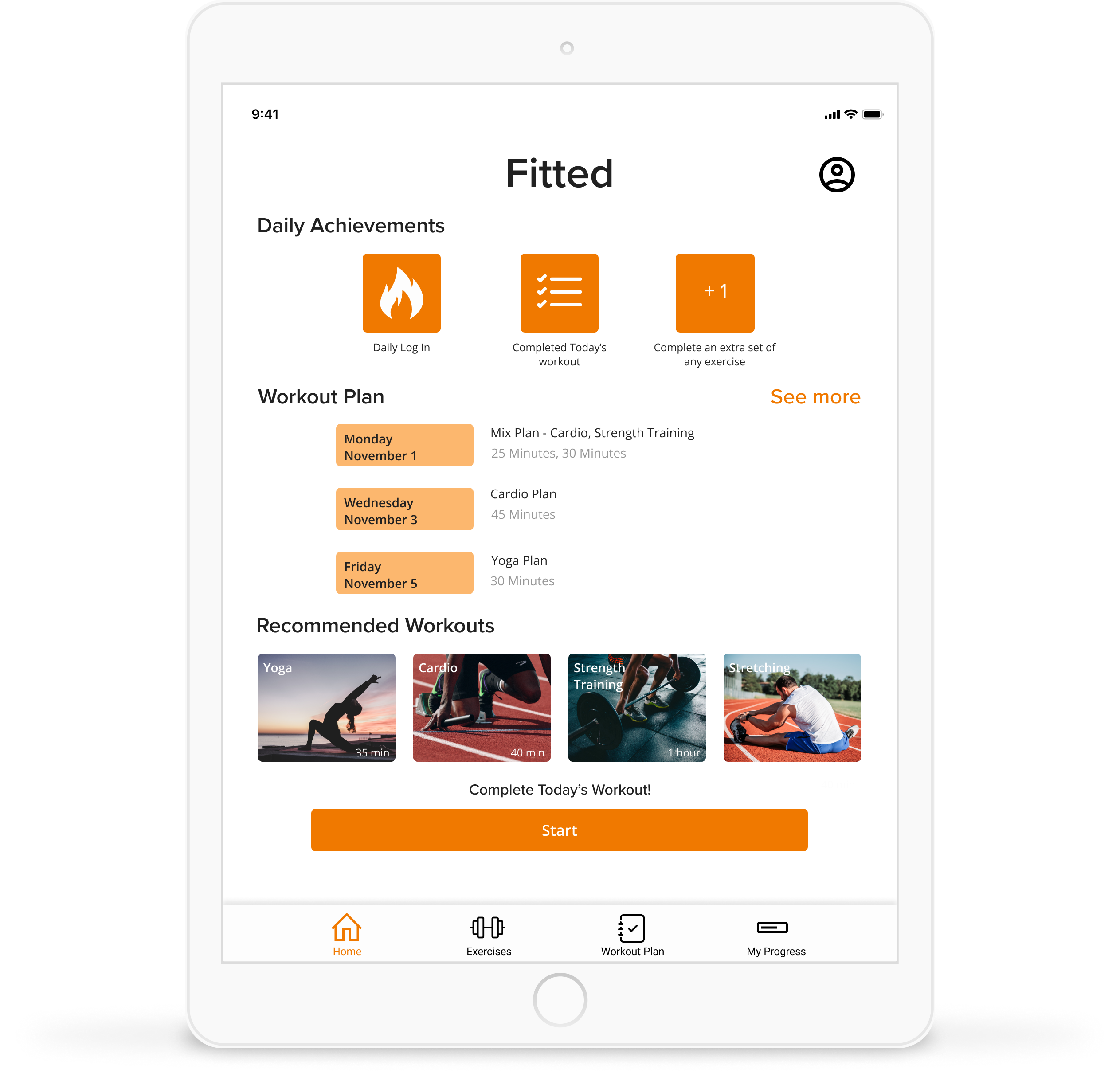
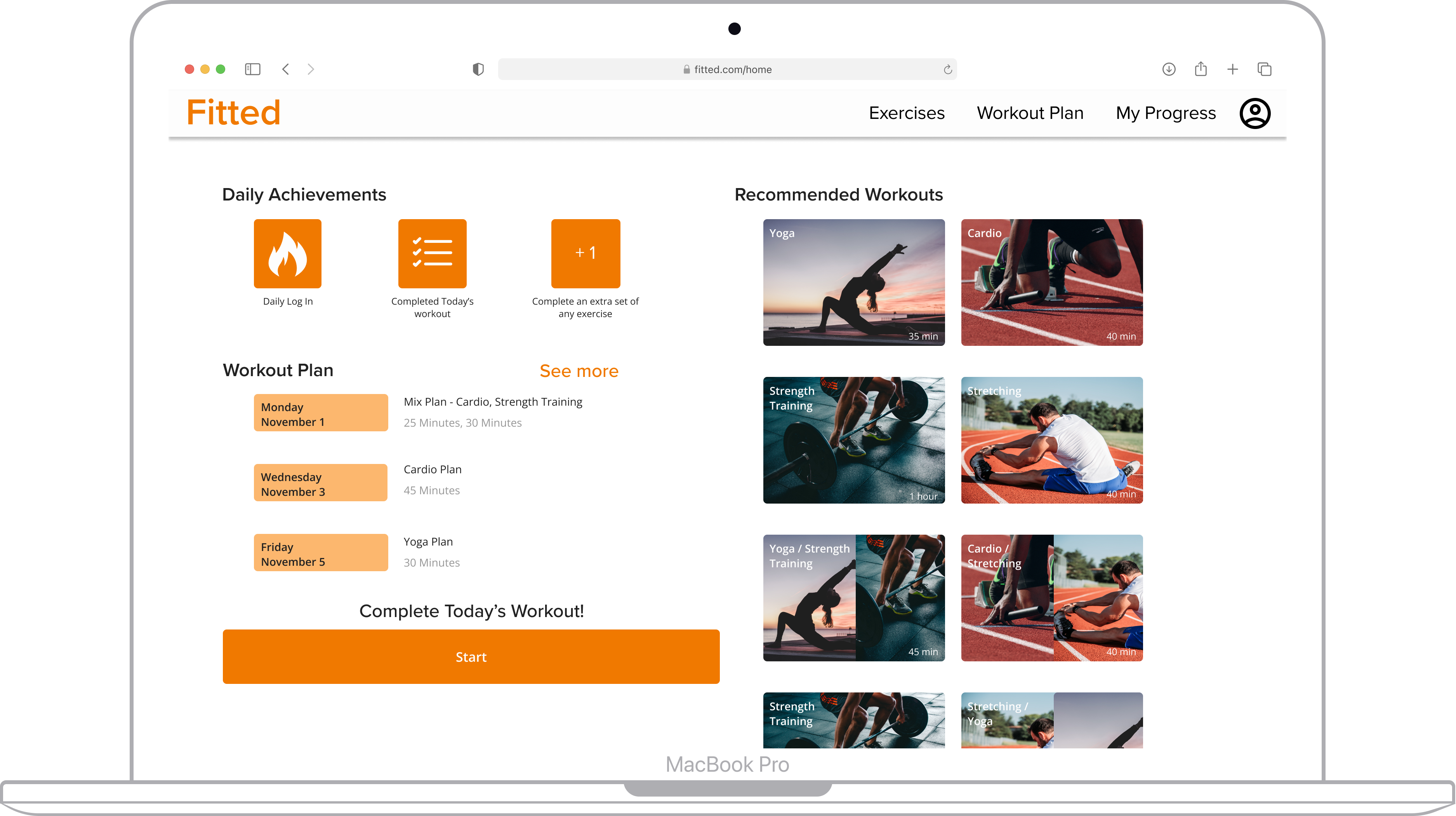
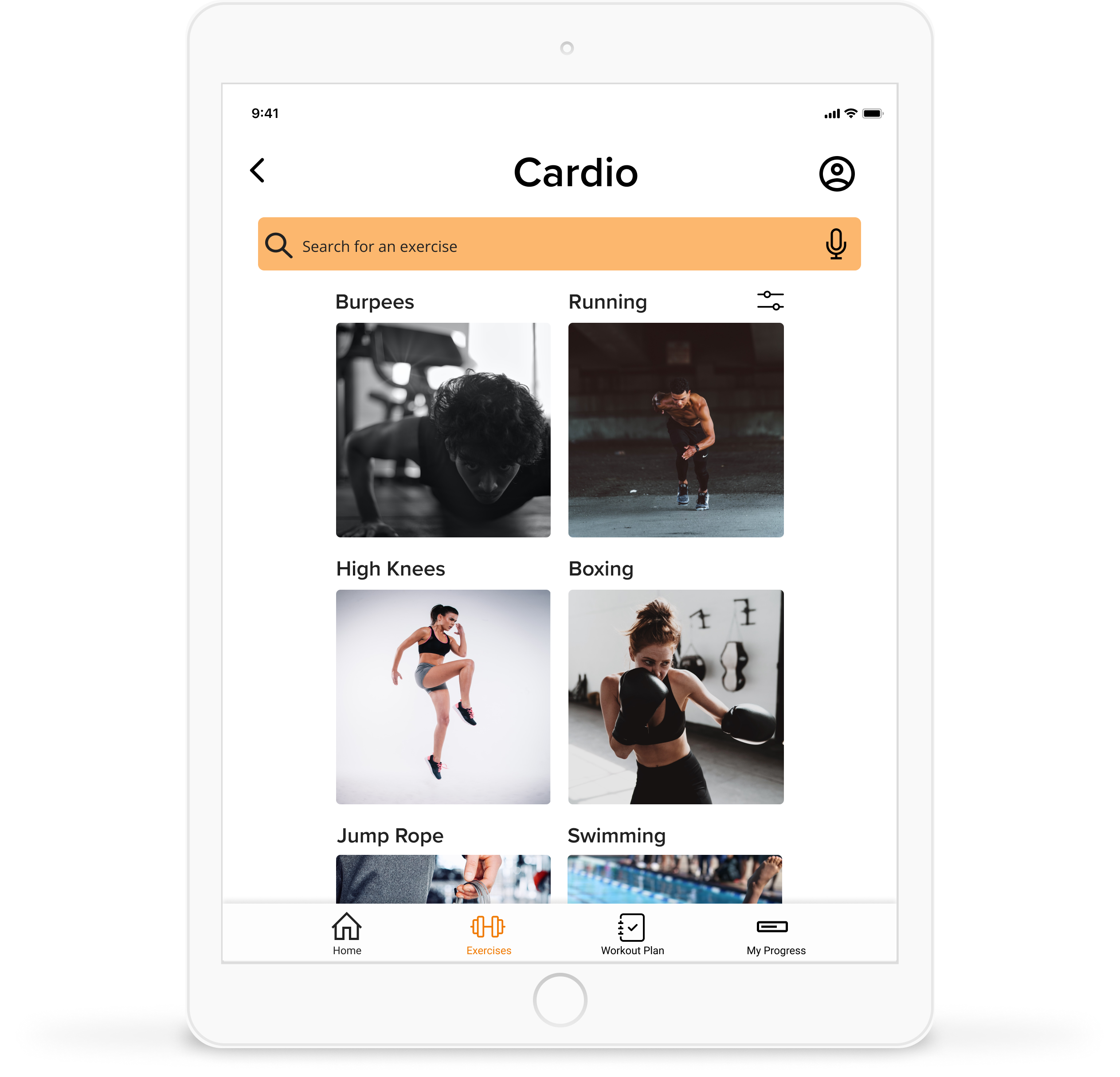
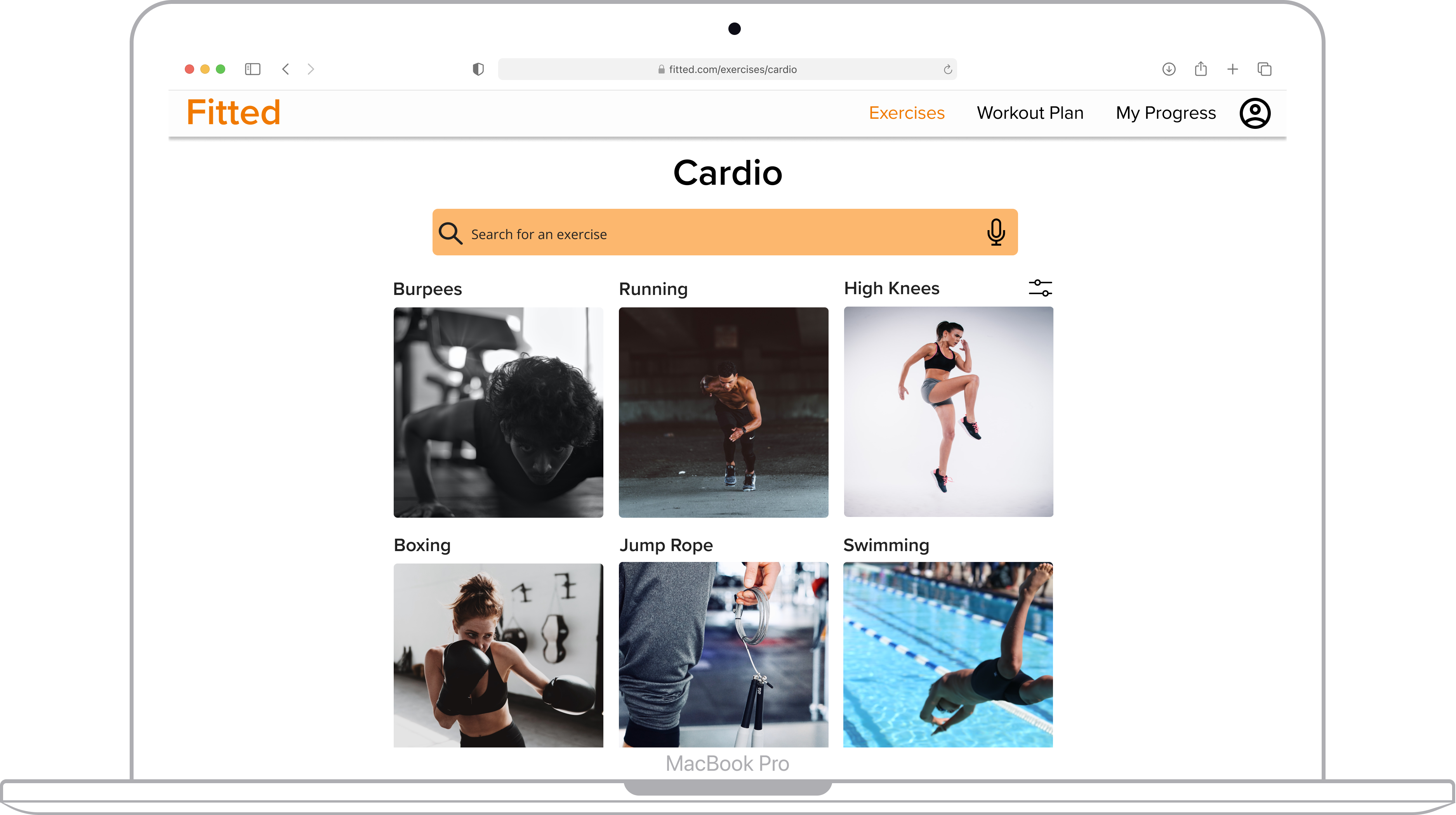
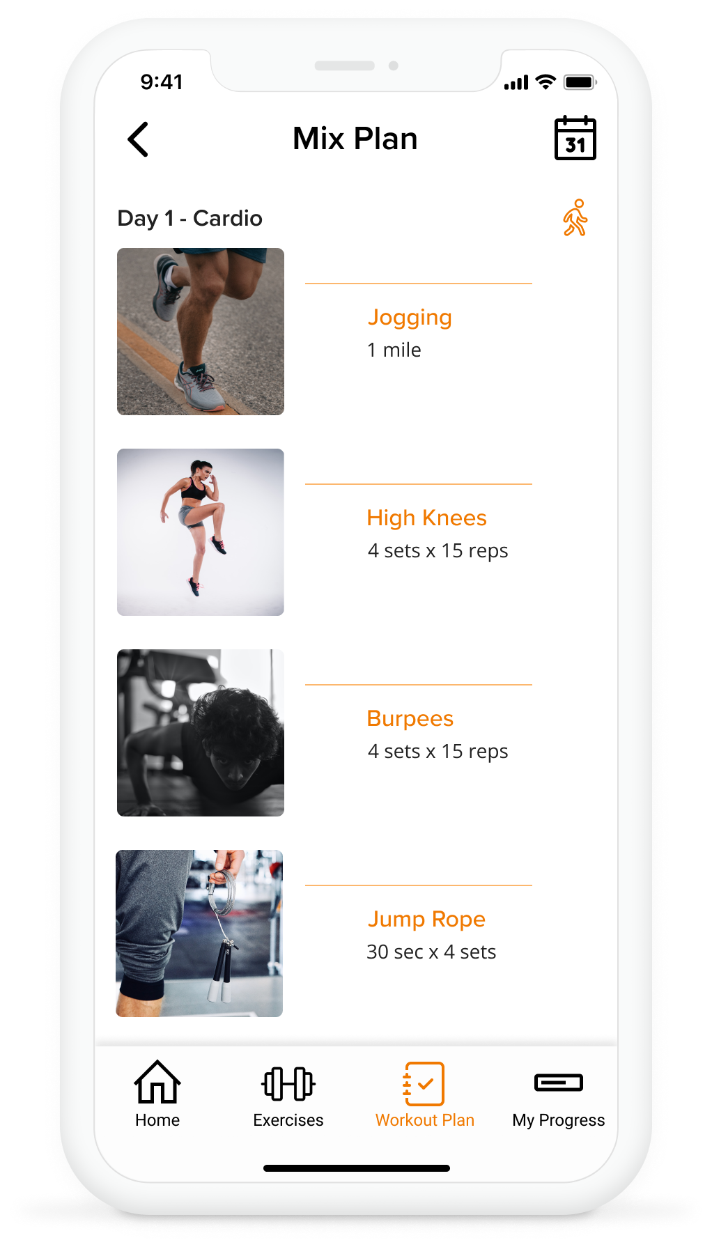
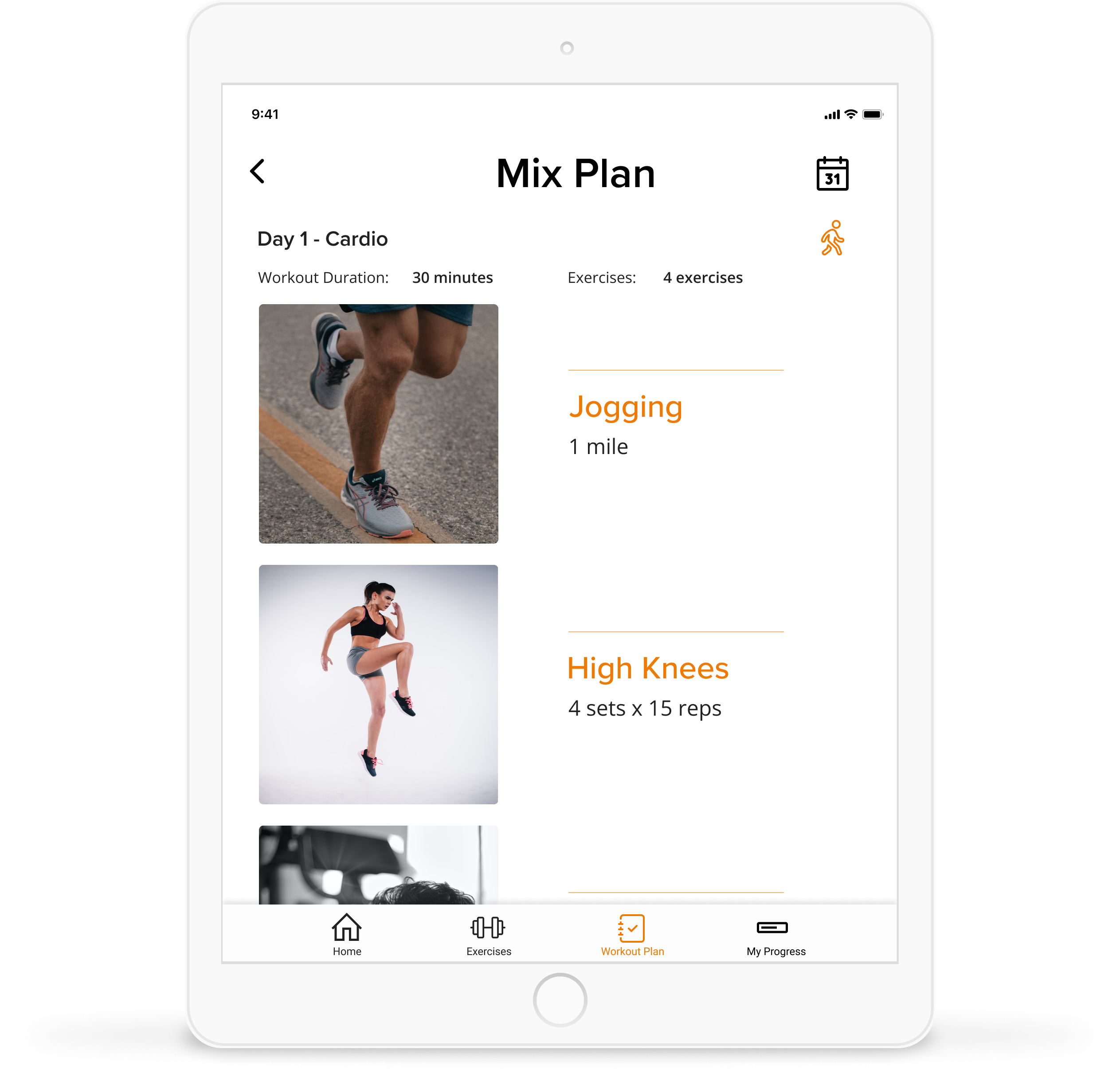
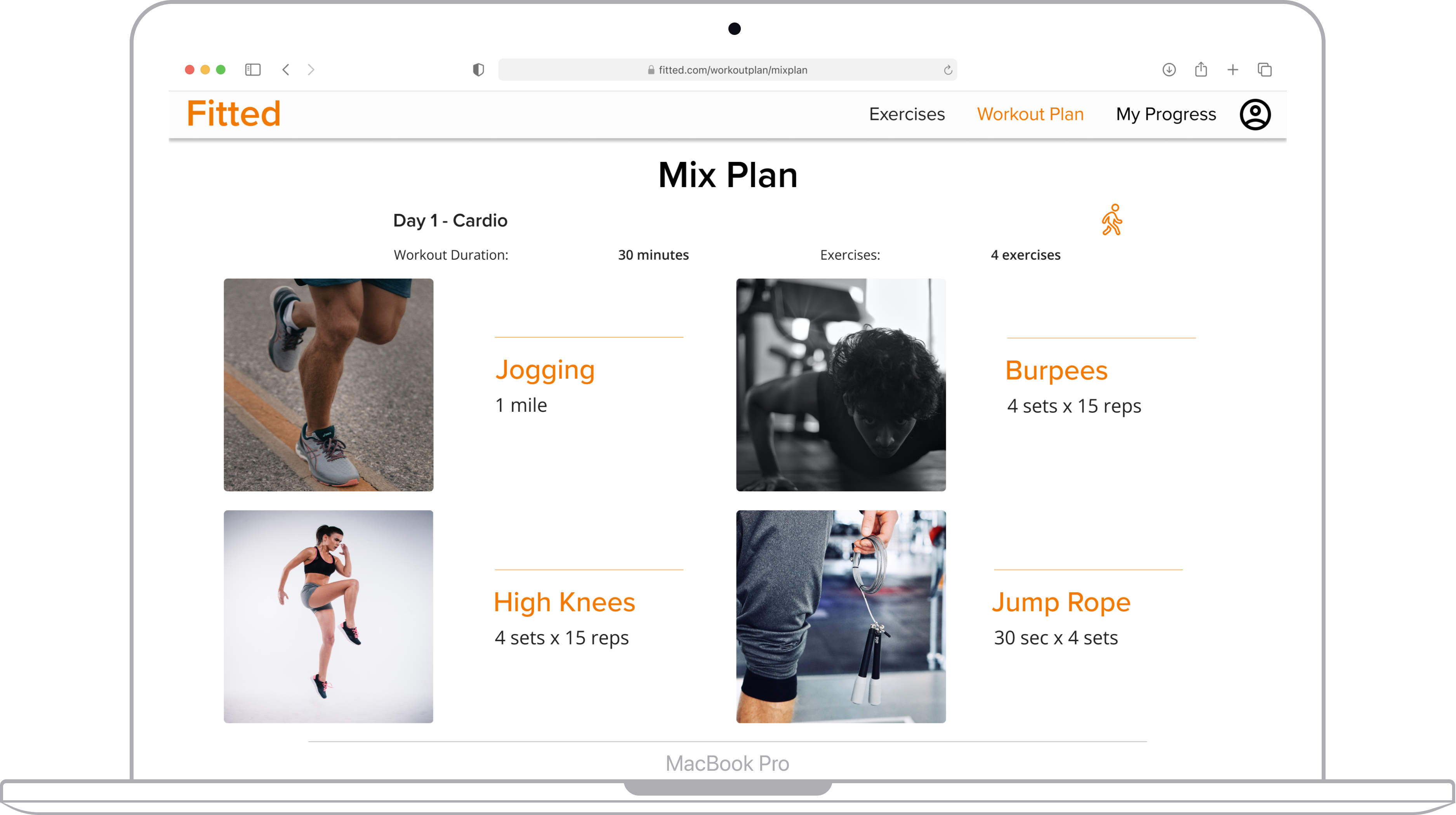
Since Fitted is designed to be native iOS app meant to be used across a variety of different devices, I made sure to include mock ups for tablet and desktop screen sizes for the Home Screen, Selecting an Exercise, and Viewing a Workout Plan.
To improve upon the user experience of the app I would conduct a round of usability testing with the prototype to see what users think of navigating through the screens and make changes based on their feedback. After making those revisions I would then design the remaining screens for the tablet and desktop breakpoints.
This case study reinforced the importance of consistency in design. Consistency in terms of the visual hierarchy of elements on the page, an 8px grid system for placing elements and use of color depending on the use case was something that I appreciated as I iteratively made changes to the screens. I found that I did not have to think too hard about how to space UI elements, what colors and fonts to use, and line weight for icons since there was consistency once I created and utilized a design system for the app.