
Enlyte has a bill review/claims processing app that is being redesigned in order to move from a legacy app to a modern web app with the goal of giving users a streamlined way to accurately process bills and claims. The app is a 2000s era product that works for it's user base, but has also accumulated years of design debt and follows UI/UX design patterns of its time. As a product designer, I had to collaborate cross functionally with our stakeholders to improve usability, usefulness and reduce bill review processing time for our adjusters.
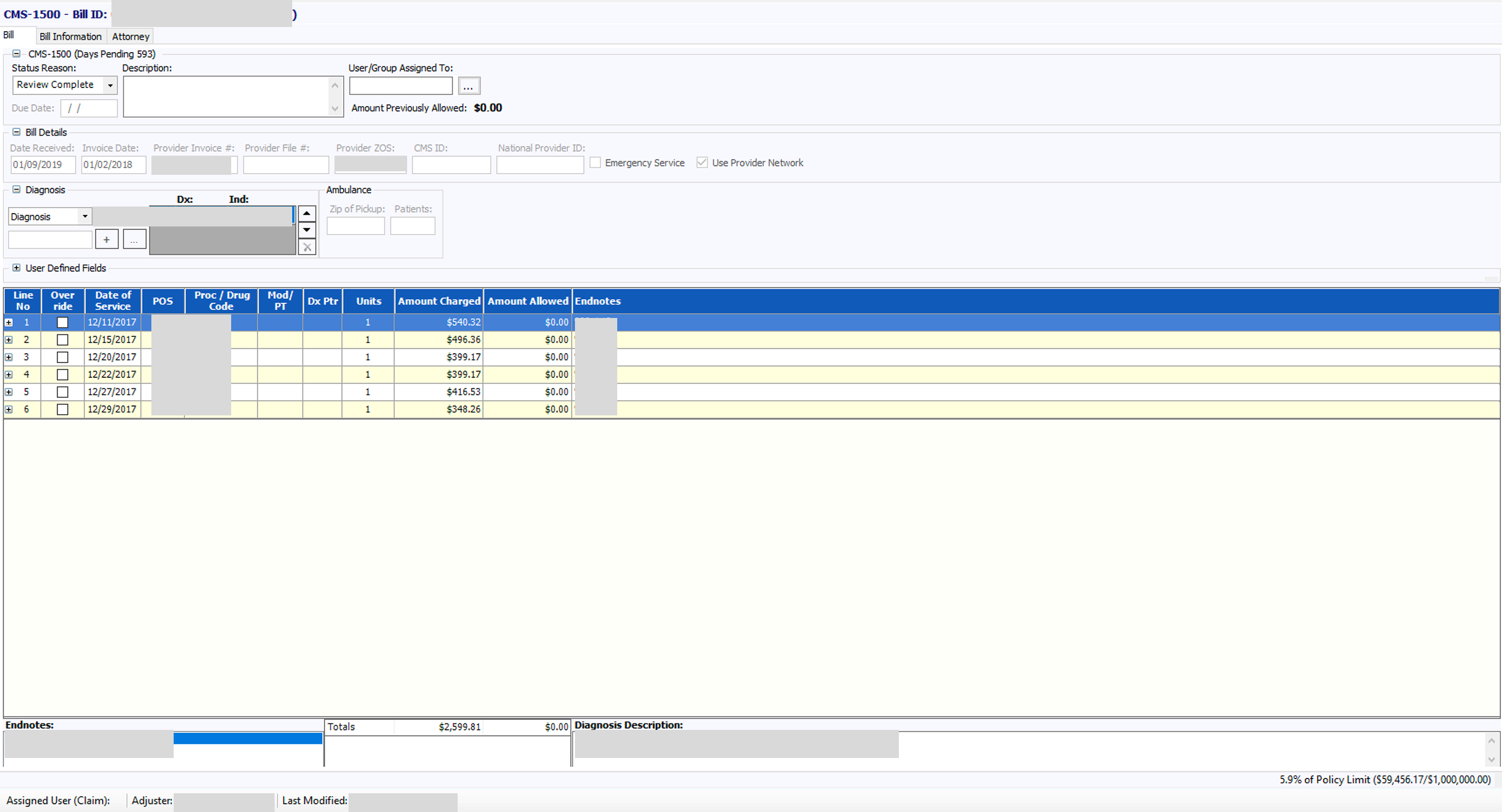
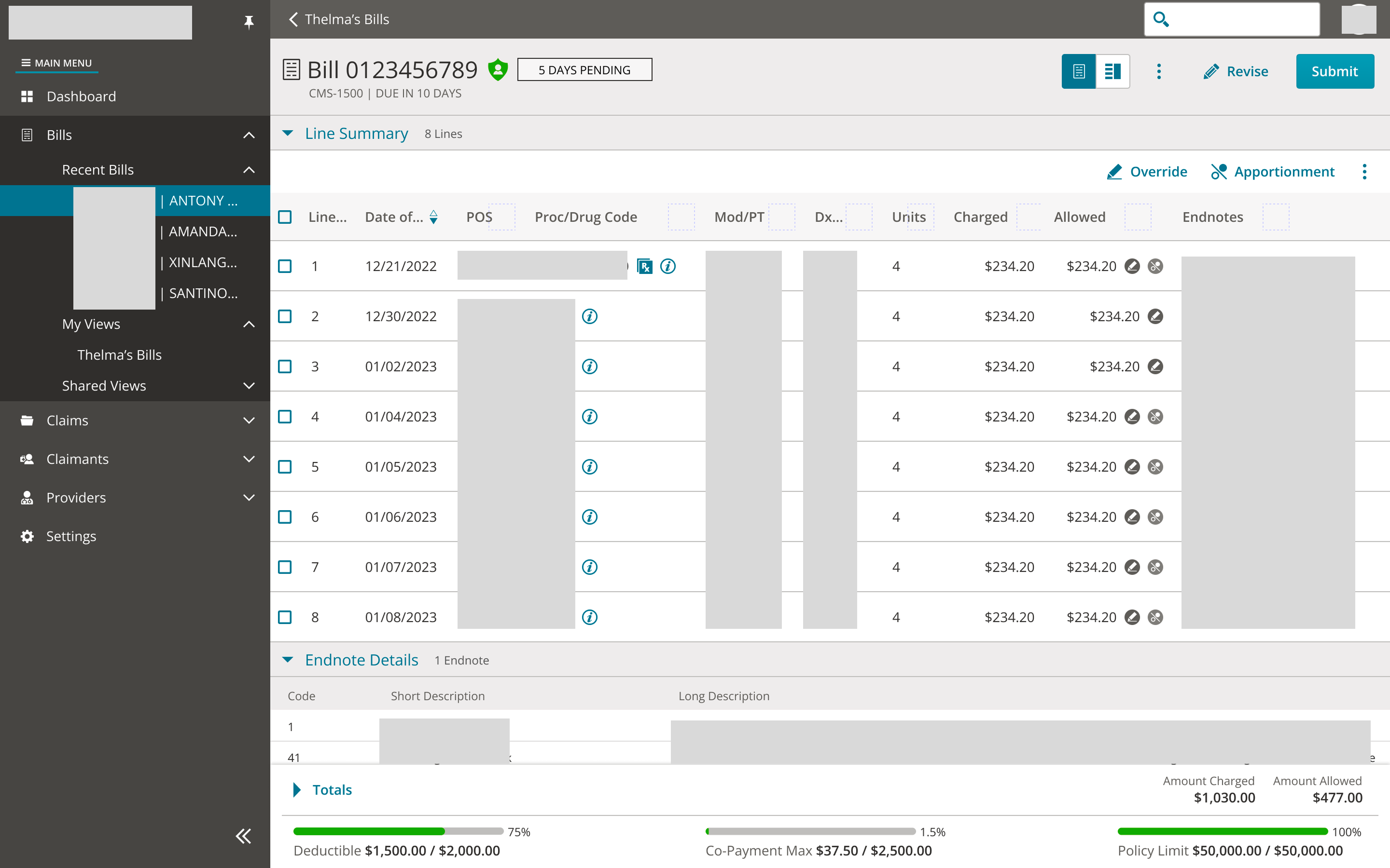
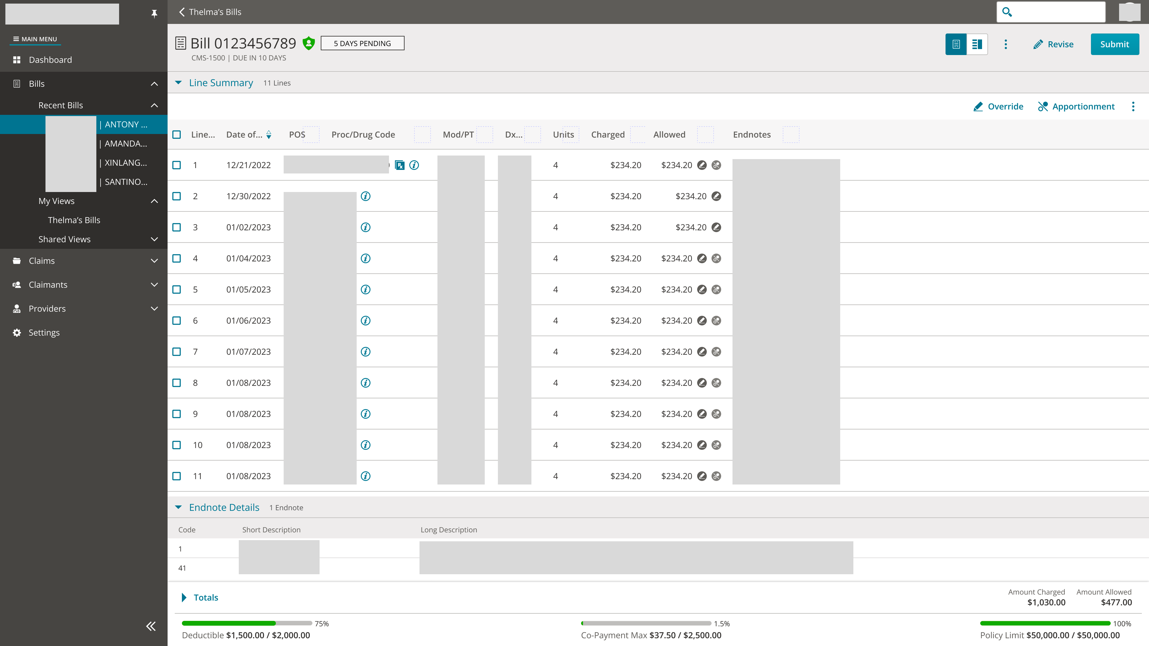
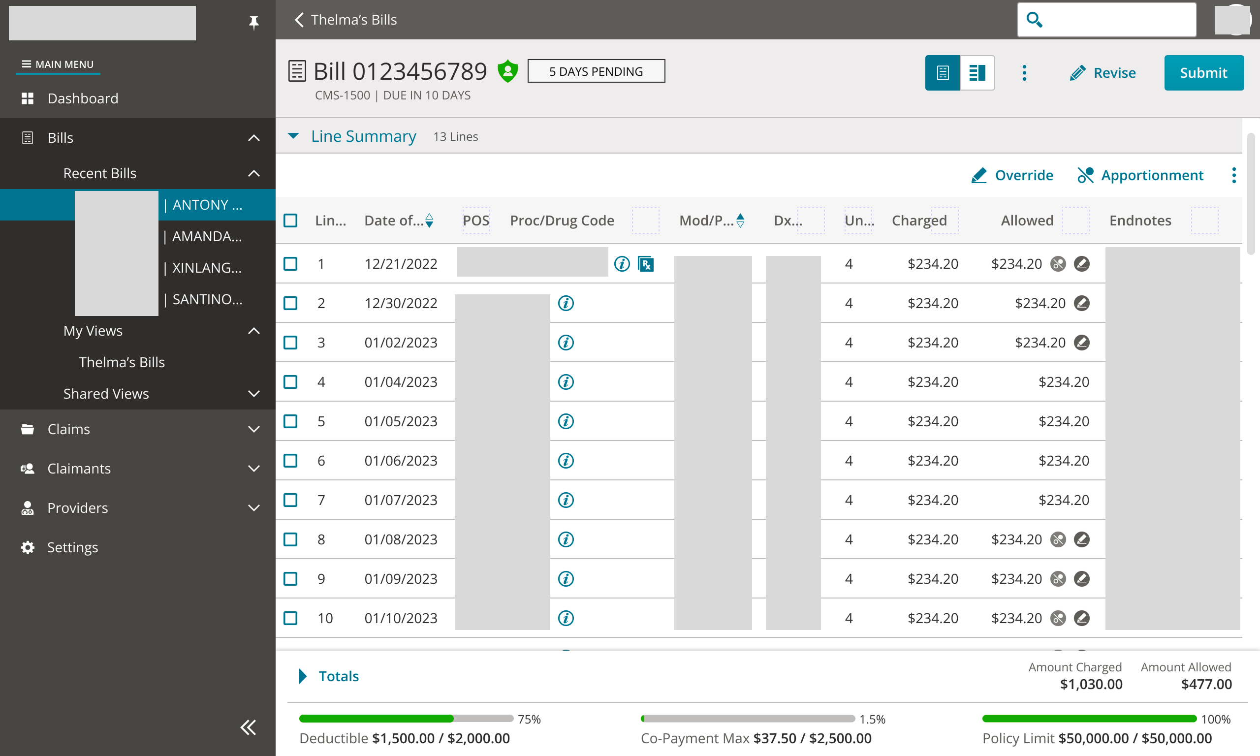
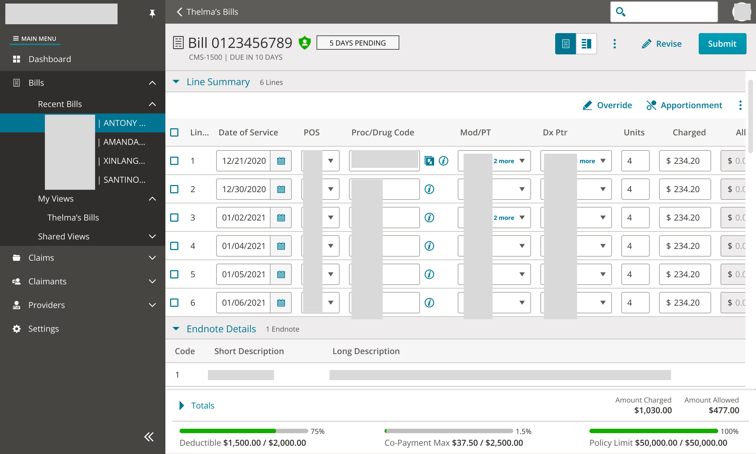
For our adjusters one of their primary workflows is to go into the Bill Line section to work or process bills. This generally involves opening a bill, going to the bill line section, making determinations based on information and taking some action (overriding a line, addressing data entry errors, duplicate lines, incorrect codes, etc). Due to the information density of the page, importance of the bill lines and multitude of actions adjusters may take, it's crucial for this section to be easy to navigate.
In our redesign, stakeholders had questions regarding how many lines to show, a focus on how we would be supporting 100-1000+ lines on a single page, issues with column resizing in the data grid not functioning properly in our test environments and double scroll issues (scroll on data grid and scroll on page).
In order to address these concerns design decided to break things down and initially focus on two main areas: Optimizing the experience for most users most of the time and reducing excessive scrolling. Given our most constrained viewport of 1280x768, I needed to ensure that we limit excessive horizontal and vertical scrolling when it can be avoided and optimize the number of lines shown before scrolling occurs.
Considerations:
Bill Line Optimization
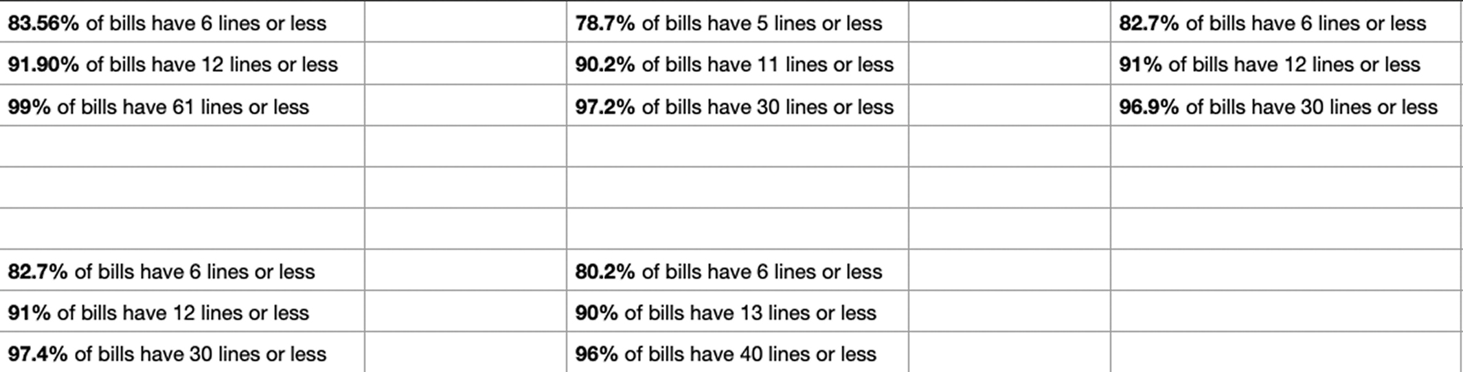
To determine how many lines to optimize for it made sense to get a baseline of the average amount of bill lines that adjusters work. I worked with design leadership and software engineers to get data regarding the average number of bill line counts across some of our customer base and data on common viewport sizes in some of our other company's products to narrow down screen sizes to design for. After compiling and bucketing the data I found that:
Across 5 customers optimizing the bill lines for 12 lines would cover 90% of bills.
This information would help me now make informed decisions regarding the scrolling behavior of the bill line table.
Vertical & Horizontal Scrolling
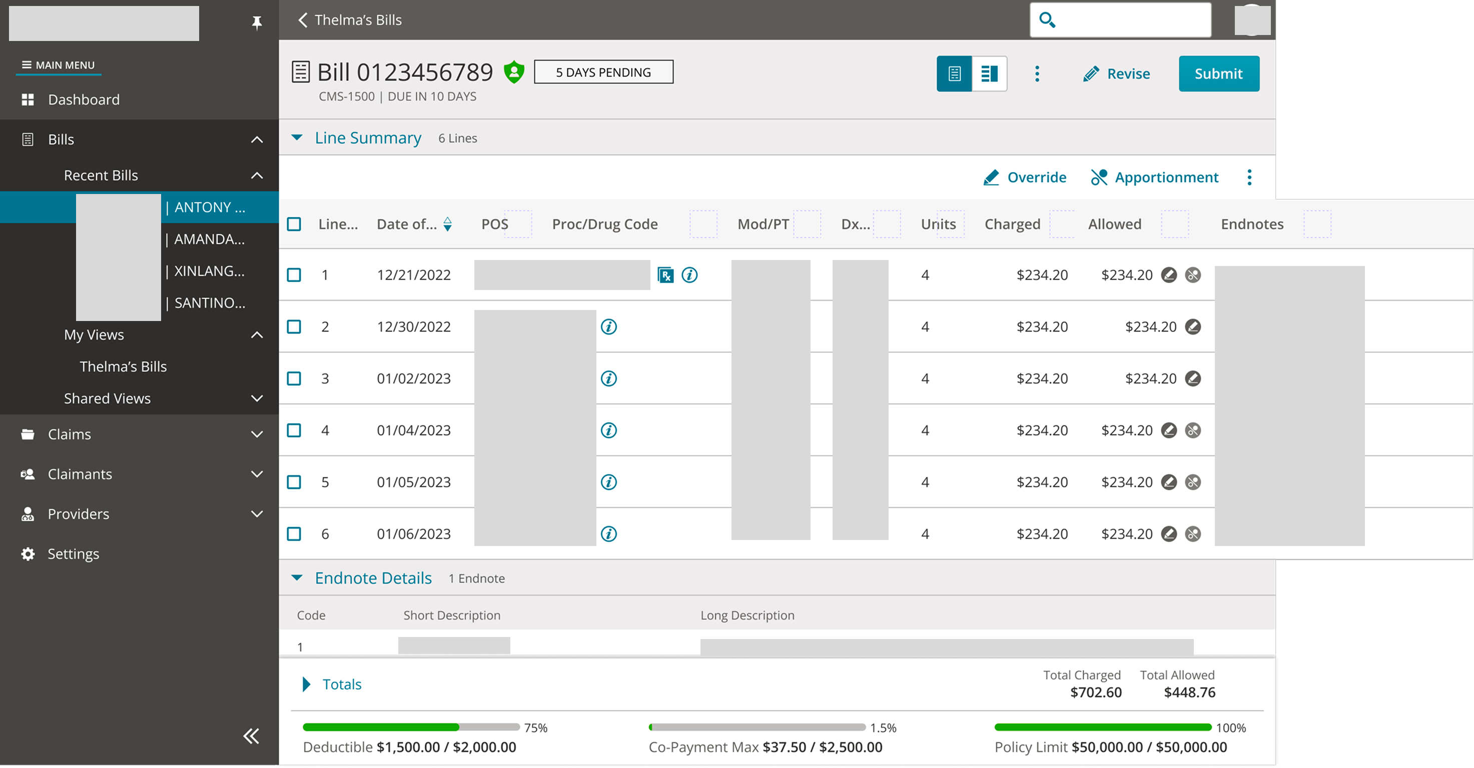
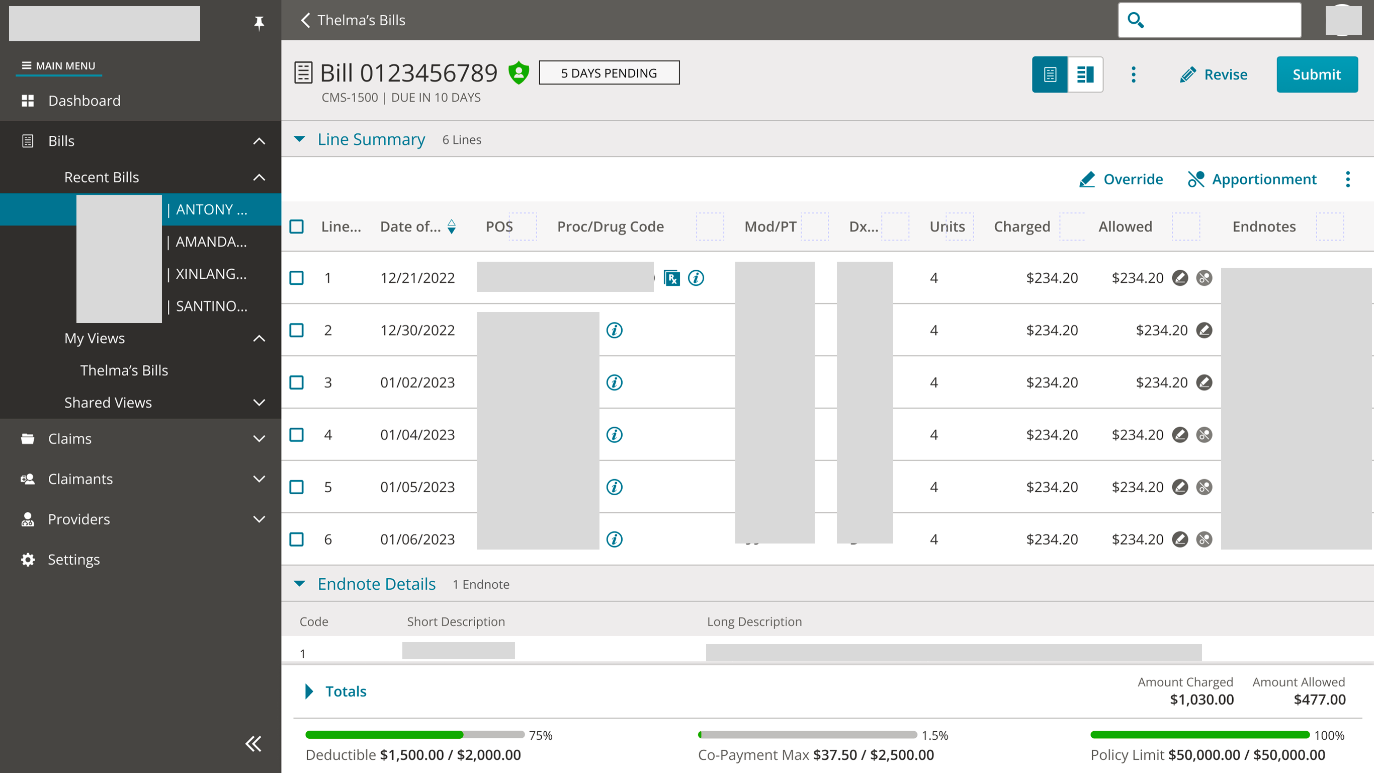
Given the density of information shown on the bill page I created some initial designs to get an idea of how the lines would look given different states of the bill.
Based on the data I received from stakeholders I determined 4 main viewports to design for:
After some design review sessions with the design team, we determine that padding in our most constrained viewport could be reduced. While the initial designs were "breathable" and "cozy" which is easier for users to scan, the 1280x768 viewport required an approach that was more "compact" while not sacrificing usability.
During this time I also met with our design system team in order to align on needs of our data grid component that our development team would consume. We were able to clarify the intended behavior of resizing the header/text cells with text truncation and received feedback on alleviating double scroll issues. This ensured that design and design system teams were both aware of what the component could support so I could give accurate design guidance to our development team.
Sharing mockups and data around average number of bills helped stakeholders focus on how many lines to support instead of focusing on cases such as 100+ or 1000+ bill lines that are edge cases instead of the average case. The mockups with larger viewports cleared up concerns around adjusters not having enough screen real estate since we design for the most constrained viewport. Ultimately the proposal for optimizing the bill lines for 12 lines covering 90% of bills made stakeholders more confident around addressing usability issues with a data driven approach.
After Development made bill line updates to our UAT environment and Project Management shared them with our customers we received great feedback.
Users appreciated the clean and modern look of the lines compared to the legacy app. They felt it was easier to navigate and intuitive making it easier to understand with frequent use. Being able to open and close sections was also helpful within the bill page so they could reference specific sections they needed in relation to the bill lines.
When practicing good design, it's important to take user feedback and iterate. In these same customer sessions we received feedback that some keyboard shortcuts and patterns were changed or missing. In the legacy application users were able to copy bill lines using spacebar and it became a pattern many users became accustomed to. Since these shortcuts weren't prioritized, they didn't make it into that specific iteration. Tab order across fields when they were in a editable state and inability to "click and drag" to select a subset of lines were also concerns that were brought up as well.
I continued to work with internal stakeholders to provide design guidance, ensure our recommendations followed patterns established by our design system team and ensure that these interactions work as intended.
The process of working through bill line usability helped me understand how to work with different stakeholders, manage constraints and learn how design can guide conversation. Early on when issues was surfaced, stakeholders were unknowingly hyper focused on supporting an edge case instead of the average case and development at the time was struggling to load large data sets efficiently. Working with these stakeholders to find bill line data from our customers, determine the average amount of bill lines users see and create mockups helped them visualize and refocus on the user needs.
Overall this experience help me gain confidence as a designer to share ideas with the team and work collaboratively in order to provide a streamlined and clean user experience for our users so they can create impactful work.